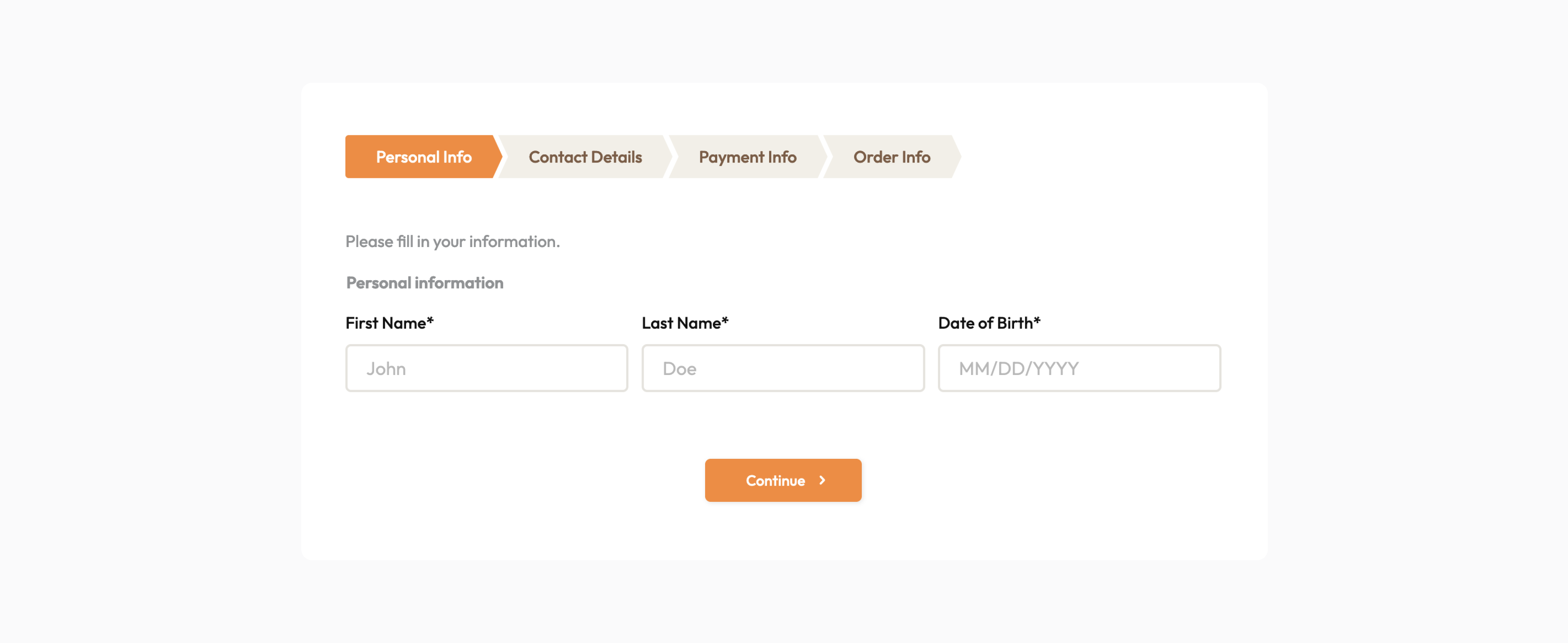
In today’s tech-driven world, forms simplify data gathering for individuals and organizations alike. From leisure to project management, they serve diverse purposes and appeal to audiences of all sizes.
As Zig Ziglar famously said, “Simplicity is eloquent.” Simple forms not only save time but also encourage higher completion rates, boosting productivity for everyone involved.
In this blog, discover five easy ways to create simple yet effective forms for better data collection. By sharing your forms or embedding them into your website, you can enhance data collection and gain valuable insights into visitor behavior.
Here are five ways to simplify your forms:
Minimize the use of fields
When designing your online form, only ask for the information necessary to achieve your form’s purpose. Forms overloaded with fields can overwhelm users, leading to abandonment and low submission rates.
Unbounce surveyed a company, showing that their conversion rate increased by 120% after reducing their form fields from 11 to 4. It indicates how the number of fields affects your completion and conversion rate.
Before finalizing your form, filter your questions and removing fields that won’t contribute much to your goals. For example, if you’ve already asked for the user’s email and don’t plan to call them, you can remove the phone number field.
If you require additional information that isn’t essential, make it optional for users. When required fields are clearly marked and optional ones aren’t, users know what they must fill in and what they can choose to leave blank.
Create error messages
Sometimes, online forms wait until the end to tell you about mistakes, which can be annoying and time-consuming. It’s better to show errors right away, next to the field where they happened. This helps people fix mistakes quickly without getting frustrated. It makes filling out forms easier and increases the chances of getting them right.
Here’s how PlatoForms sets validations for phone numbers: it checks if they meet the defined value range or length. If not, the form displays an error message, ensuring that the entered information is correct before submission.

Use conditional logic
Sometimes, you might have to put fields or info in your form that not everyone needs to see. This helps your form skip questions that don’t apply to certain users.
For instance, think about a form for buying something online. If you have a discount code, you have to type it in for a deal. If you don’t, you can move on to the next step.
With conditional logic, you can hide or show these fields automatically. You can also make fields optional or required, and even do calculations based on what users do.
Read more: User-Friendly and Interactive Forms with Conditional Logic
Use navigation and progress indicators
When designing forms, it’s crucial to consider navigation and progress indicators. Confusing navigation can frustrate users and lead to incomplete submissions due to confusion about required information.
Similarly, omitting a progress indicator can leave users uncertain about their progress, especially in multi-step processes like online checkouts.
To address this, break your form into sections or pages, and add a progress bar. This not only guides users through the process but also encourages them to continue, fostering a sense of achievement with each step completed.
In this way, you can make the form more user-friendly by organizing questions into groups. For example, grouping demographic questions together and previous work experience questions together can make the form easier to navigate.
Here’s how PlatoForms improves forms: it splits long forms into smaller sections with grouped questions, making them easier to fill out. Plus, a progress bar shows how far the customers have come!

Be accessible
Improving your online form’s accessibility is super important to include everyone. When making a new form, think about users who might have trouble with it. Here are some easy ways to make your website more accessible:
-
Font size: Pick a font size that’s big enough for everyone to read, like 10px or bigger. Avoid using fancy fonts that might be hard for some people to understand.
-
Contrast: Use colors that stand out for the text and background so it’s easy to read. For instance, black text on a white background works well. Stay away from color combos that are tough to see, like light gray text on a white background.
-
Language: Keep your form instructions and labels clear and simple. Don’t use fancy words or complicated terms that might confuse some users. And if someone messes up filling out the form, give them a short and clear error message.
Create simple forms with PlatoForms
Creating online forms is easy and powerful for connecting with customers and gathering important information. Follow the tips above to design forms that people will love to fill out.
Wondering about online forms? PlatoForms is a fantastic tool that turns PDFs into online forms and builds online forms. It’s user-friendly and offers cool features like customizable designs and smart workflows. Want to give it a try? Sign up here and see how PlatoForms can transform your form experience!


