Online fillable forms are crucial elements of websites and play a significant role in capturing user information and converting visitors into leads or customers. To maximize conversions, it is essential to design online forms that are user-friendly, visually appealing, and optimized for conversions. Here are some design tips for creating effective online forms:
8 valuable tips to enhance your experience:
Keep it Simple
When crafting online forms, simplicity is paramount. To enhance user experience and boost completion rates, avoid overwhelming your customers with an abundance of form fields. Stick to soliciting essential information, adhering to the principle that less is more.

Excessive requests for information can be counterproductive, potentially deterring users and increasing the likelihood of abandonment, errors, or distraction.
Consider reassessing the necessity of certain questions, such as “Where did you hear from us?” In the age of advanced analytics and abundant customer data, such inquiries may be redundant and outdated.
For longer forms, break them into logically grouped segments to reduce intimidation. Users often prefer segmented forms with clear pagination, facilitating easy navigation through each step.
Clear and Concise Prompt
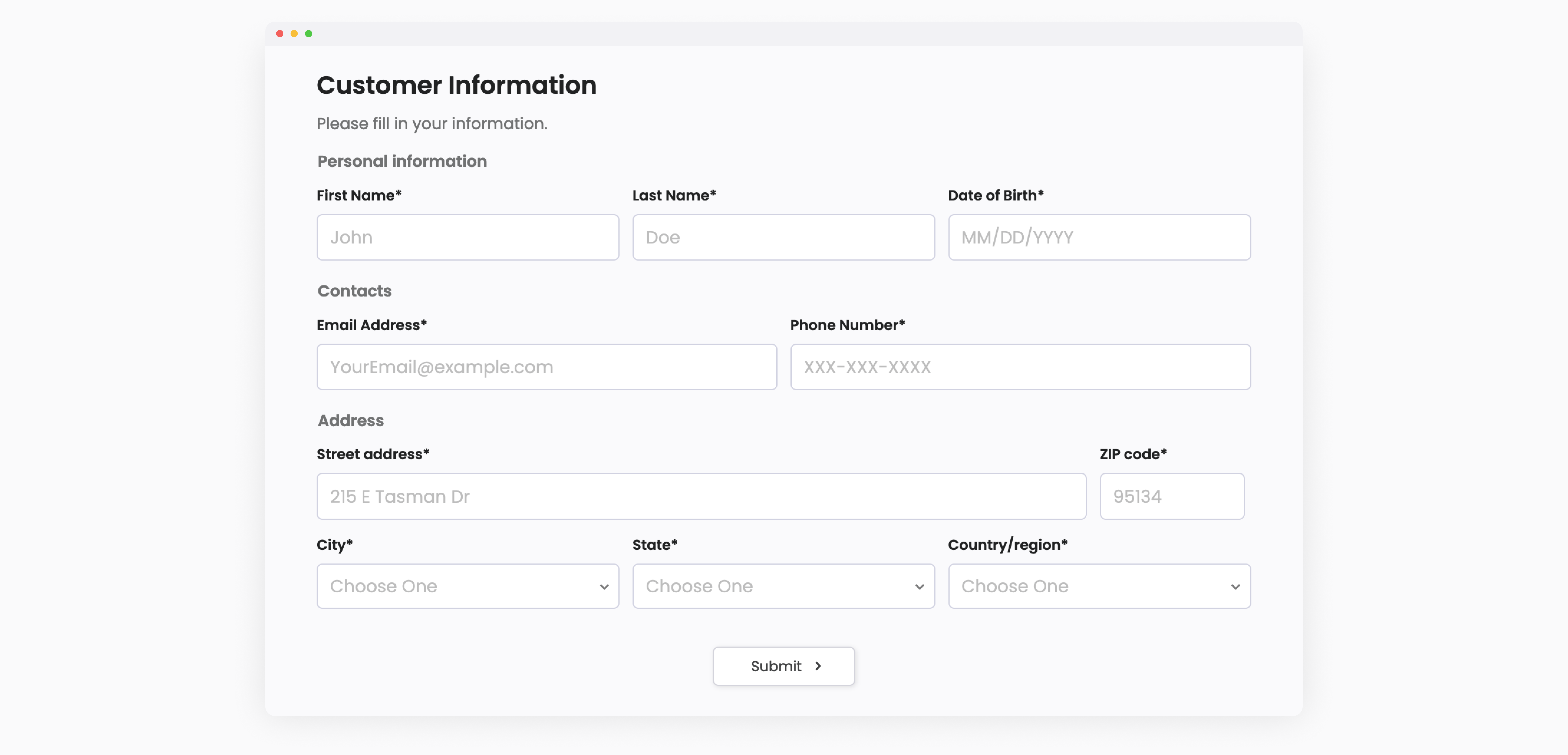
Use clear and concise labels, help texts, and placeholders for each form field. See the example below:

These prompts provide specific instructions or examples, making it clear to users how they should input information in each field, They guide users effectively and eliminate potential confusion, ensuring a smoother form-filling experience.
Visual Hierarchy
Leverage visual cues, including font size, color, and spacing, to establish a distinct visual hierarchy. Emphasize crucial fields or sections, directing users’ attention and facilitating easy form scanning. PlatoForms offers a range of customization options to assist you in creating visually appealing online forms.
Error Handling
Implement real-time validation to provide instant feedback to users when they make mistakes. Clearly indicate any missing or incorrect information and provide helpful error messages.

PlatoForms allows you to set validations for form fields, like making sure a password is long enough. If someone doesn’t meet these defined value range or length, it shows them an error message. This helps make sure the information entered in a form is correct before it’s sent.
Mobile-Friendly Design
Make your form work smoothly on phones and tablets by using smart design tricks, for example:
-
Arrange the form fields in a way that’s easy to read on different screen sizes - either in a single column or by stacking them up.
-
Make sure buttons and input boxes are big enough to tap with finger.
-
To save space and keep things neat, you can use placeholder text inside the form fields. Test your form thoroughly on different phones and browsers to fix any problems.
-
For the easiest experience, use a mobile-friendly form-building platform like PlatoForms to create fillable online forms that work well on all devices and browsers.
Progress Indicators
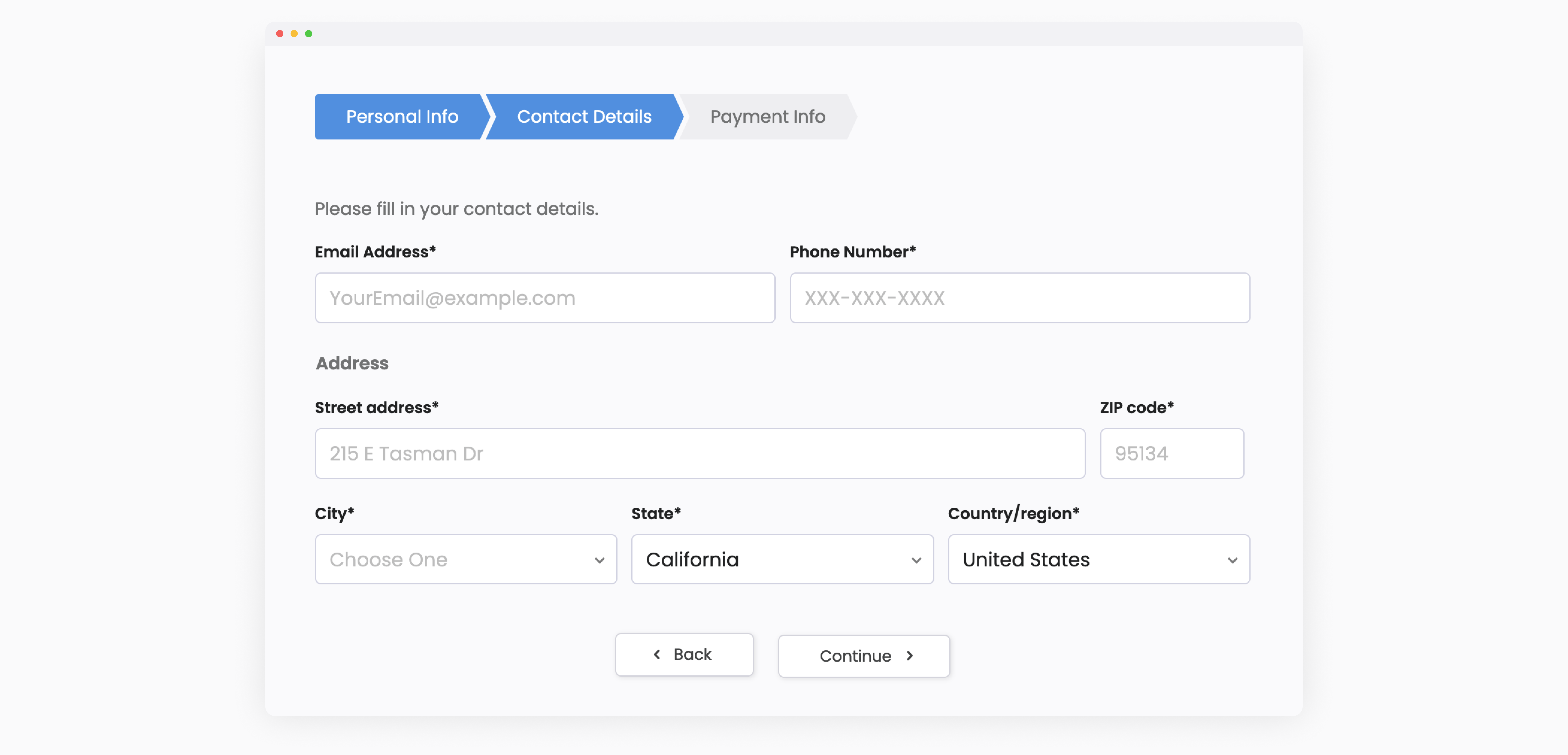
If your online form has multiple steps, include progress indicators, as shown below.

PlatoForms offers Section Break and Page Break to assist you in organizing multiple steps into different sections or pages. This helps customers track their progress, understand the form’s length, and lowers the chances of them giving up midway through.
Trust Signals
Incorporate trust signals, such as security badges or testimonials, to reassure users that their information is secure and to build trust in your brand.
Call-to-Action (CTA) Placement
For the submit buttons, refer to the following guidelines:
-
Visibility: Position these buttons prominently. Use contrasting colors, a bold design, or a distinct button style to ensure it catches the user’s attention.
-
Mobile Optimization: If your form is accessed on mobile devices, ensure that the submit button is easily tappable and clearly visible even on smaller screens.
-
Logical Progression: If your form is segmented into multiple steps, place the submit button at the end of each step or at the final step. This provides users with a clear indication of progress.
For a CTA button to encourage users to take action, use compelling copy.
In Conclusion
Remember, regularly testing and optimizing your online forms based on user feedback and analytics is key to continuously improving conversions.
By implementing these design tips, you can create online fillable forms that are more user-friendly, visually appealing, and ultimately drive higher conversions on your website.
Discover the magic of PlatoForms! Easily turn your static PDFs into cool online forms. Improve your form-making skills, grab attention, and get more people to respond. Jump into PlatoForms today for a 15-day free trial! Sign up now!


