Design web PDF form
Tabs
Customize your form’s appearance to match your brand. You can:
- Add your logo, change fonts, and adjust colors.
- Apply themes for a quick style update.
- Fine-tune design settings for a polished look.
Access the form designer
-
Open your existing web PDF form from the Dashboard.
-
Click the Preview & Design button in the form builder at the top left.
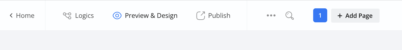
This opens a preview where you can adjust your form’s design.
Apply the themes
Themes let you change your form’s look instantly.
-
Click the Themes button at the bottom left corner.
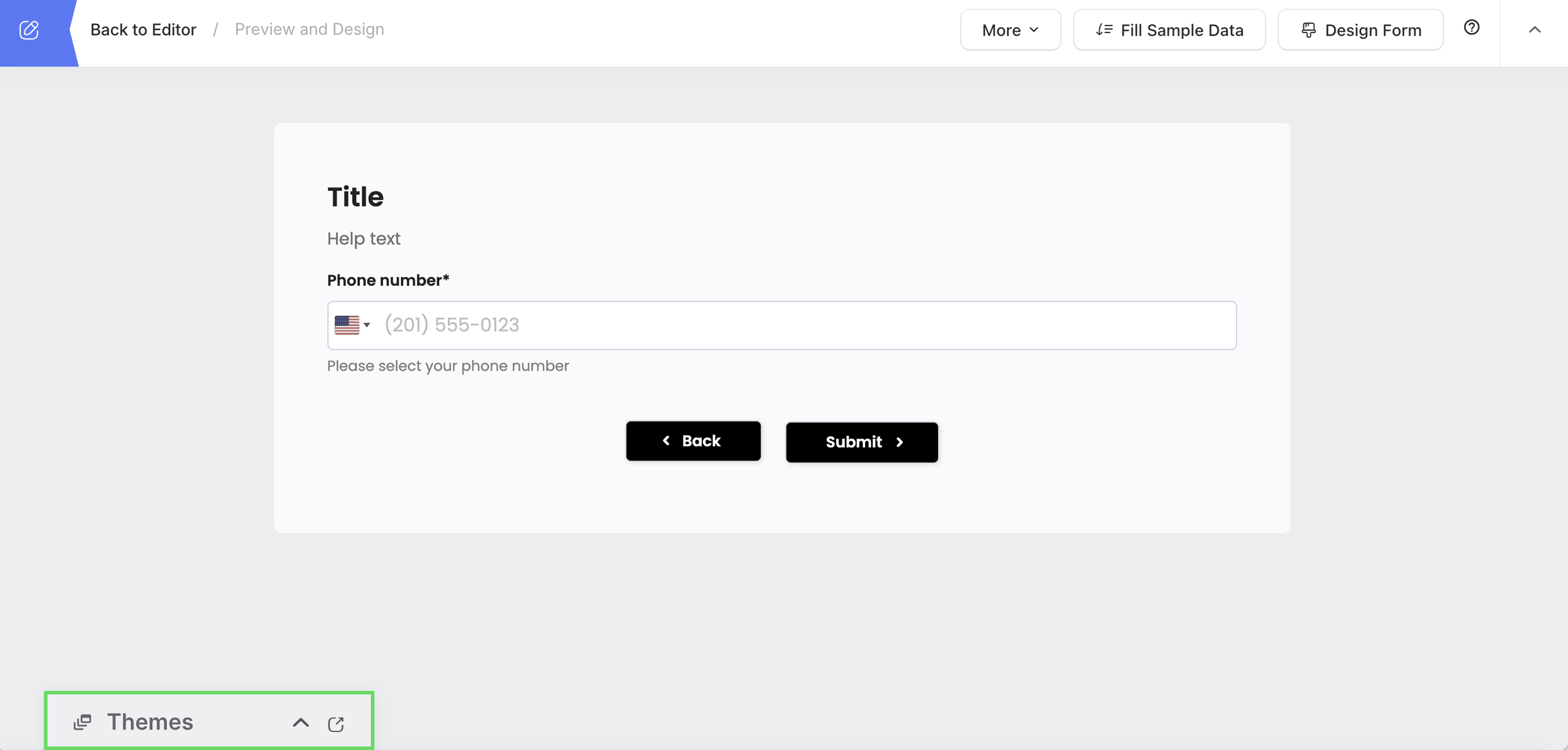
The Themes panel will appear.
-
Browse and select a theme that suits your form.
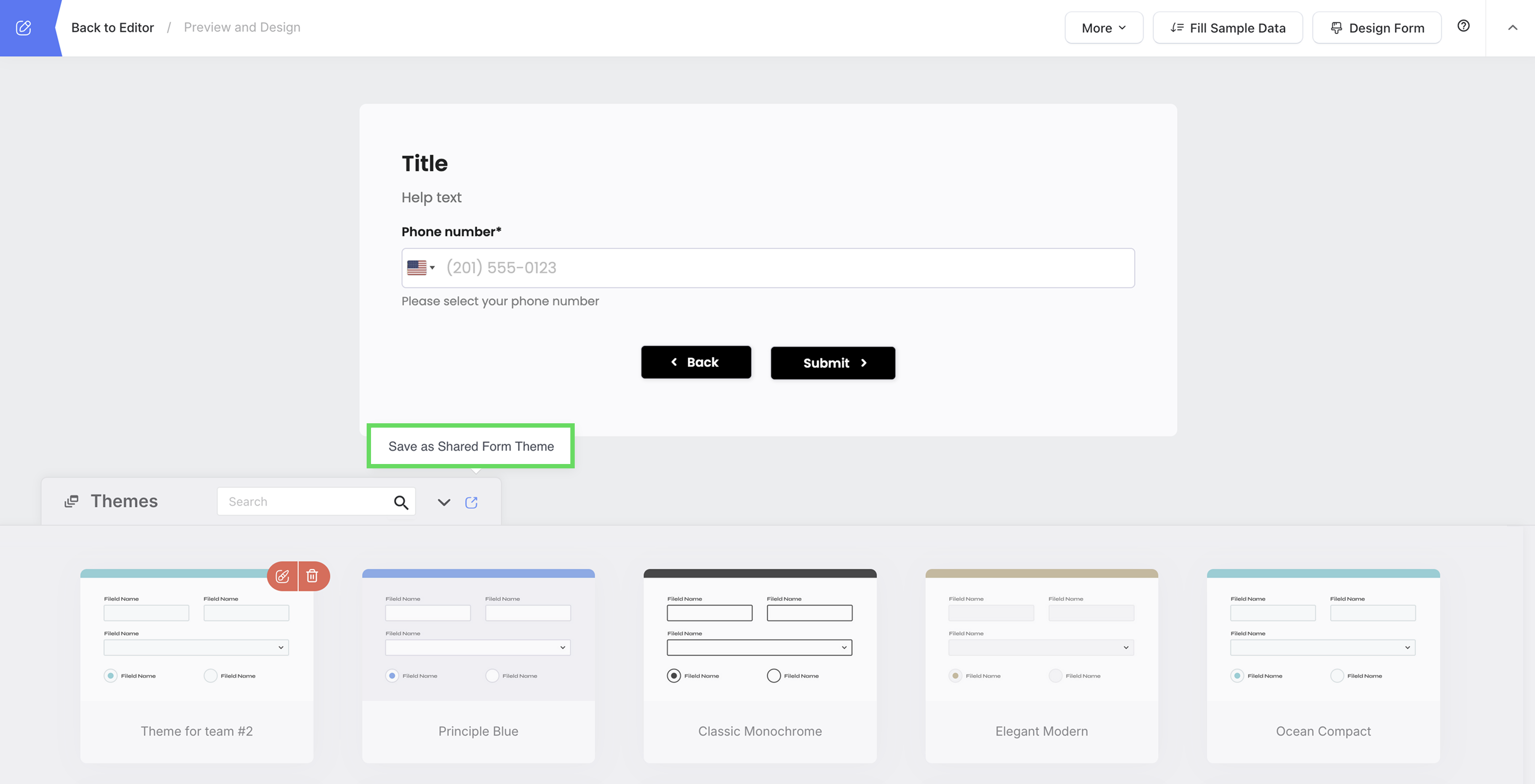
Save as shared form theme
If you want a custom theme for your team, use Save as Shared Form Theme.
-
Click the Themes button to expand the Themes panel.
-
Choose a theme or customize one.
-
Click Save as Shared Form Theme.
-
Name your theme and click Save.
Now, your team can apply this theme to other forms.
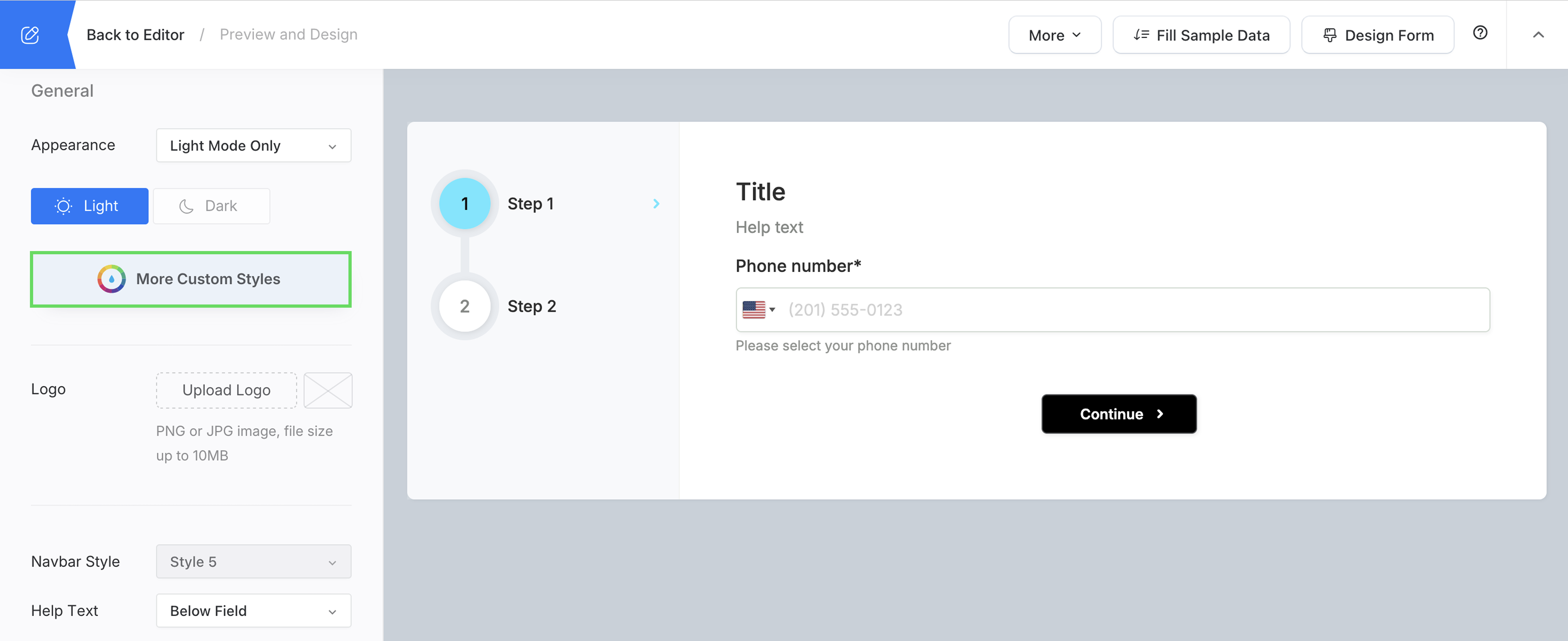
Customize the form design
You can also make more customizations to the form styles. All changes are instantly previewed.
-
On the preview page, click the Design Form button in the top right corner.
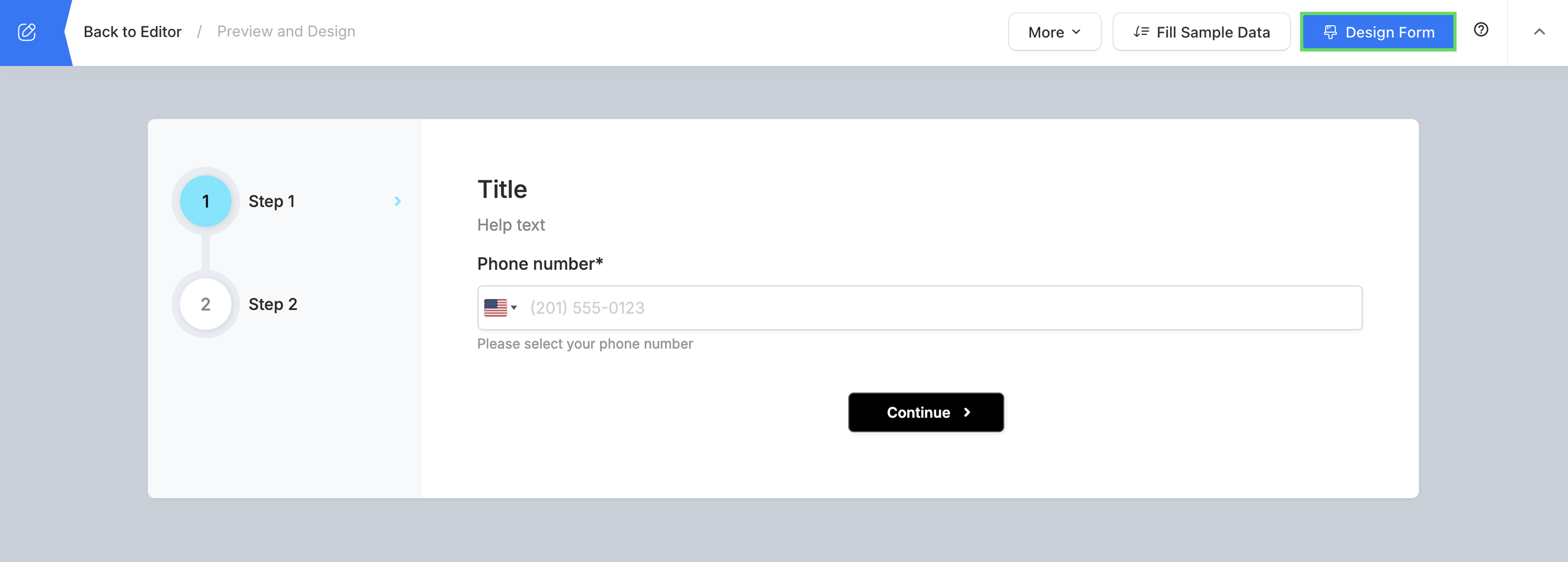
You will open the Design Form panel.
-
Modify the design as needed.
NoteLearn about available customization options in the Form design properties section.
-
After making your desired modifications, click Save to apply your changes.
Form design properties
| Property | Description |
|---|---|
| Appearance | Customize the form’s visual theme:
|
| Logo | Upload a PNG or JPG (max 10MB) to display a logo on the form.
|
| Navigation Bar | If your form has multiple pages, enabling the navigation bar adds a top menu, allowing users to switch between pages. Note: To add pages, insert a Page Break when designing your form. |
| Navbar Style | Once the Navigation Bar is enabled, select a style that matches your form’s design. Options may include Tabs, Progress Bar, or Sidebar Navigation. |
| Help Text | If you’ve added help text for form fields, choose where it appears:
|
| RTL Form | Displays the form in a right-to-left layout, suitable for languages such as Arabic, Hebrew, and Persian. This setting affects text alignment and overall form direction. |
| Rounded Corner | Adds rounded corners to the form’s elements for a smoother, modern appearance. |
| Material Style | Uses a minimalistic straight-line design for input fields, similar to Material Design. |
| Form Width | Adjusts the overall width of the form. Options include:
|
| Form Margin | Sets spacing around the form’s edges. Options include:
|
| Font | Use the system default font or upload a custom font to match your brand’s identity. |
| Font Size | Adjust the text size to ensure readability. Available sizes range from Small to Extra Large. |
| Line Spacing | Controls spacing between lines of text. Options: XS, S, M, L, or XL for optimal readability. |
| Label Layout | Defines the arrangement of labels relative to input fields. If Customized is selected, return to each field’s Properties panel to adjust individual label positions. |
| Label Width | Specifies the width of field labels to ensure consistent alignment across form elements. |
More Custom Styles
You can further customize your form’s appearance and behavior using the More Custom Styles feature.
-
Click on the More Custom Styles button in the form editor.
-
Choose from three customization options:
- Design tab: Change background images, adjust banner size, and modify layout elements.
- CSS tab: Add custom CSS to style fonts, colors, and spacing.
- JS tab: Use JavaScript to customize labels, add logic, and control form behavior.
NoteJavaScript is secure and only works with custom domains to maintain security.
-
After making adjustments, click Save to apply your changes.