

In this blog:
Why mobile-first forms matter (a lot)
Quick stat drop: Over 62% of all website traffic globally comes from mobile devices. Translation? Most people are seeing your form on their phone, not their 27-inch desktop monitor.
So if your forms don’t load well, don’t scale well, or just look like a squashed mess on a phone—you’re losing clicks, data, and possibly customers.
Now for the good news: You can make your forms awesome on every device. Here’s why you should go responsive today (like, right now).
✅ 1. Your users are everywhere (and mostly on phones)
Let’s say someone finds your form while browsing Instagram, walking their dog, and sipping boba. They tap your link, land on your form—and get a wall of text and tiny buttons. Yikes.

Responsive forms fix this. They:
- Adapt to any screen size (desktop, tablet, phone, potato if it has a screen)
- Stay readable and usable without endless pinching or zooming
- Feel like an app, not a punishment
Example: A small bakery uses a PlatoForms reservation form embedded on their Instagram bio link. Customers on mobile can easily select a pickup time and submit it within seconds.
⚡ 2. Faster forms = fewer bounces
Phones are fast. People on phones? Even faster. You’ve got maybe 2 seconds before someone swipes away and never comes back.
Non-responsive forms slow everything down. They load awkwardly, break formatting, and frustrate users.
Responsive forms load fast and keep people moving.

And you know what helps even more? Smart features like:
- Auto-advance to the next question when possible
- Big buttons for easy tapping
- Minimal open-text fields (because typing on phones = annoying)
Real world: An HR team uses a multi-step job application form built with PlatoForms. Auto-advance and dropdowns keep it fast and tappable—no laptop required.
🎯 3. Better UX = better data
If your form looks bad on mobile, people bounce. If it looks great and works smoothly, they stay—and actually fill it out.
That means:
- More form completions
- More accurate responses
- Less rage-typing
And if you’re collecting leads or running surveys, that’s not just better UX—it’s better business.

Use case: A company looking to grow its subscriber base shares a form through email and mobile ads. With PlatoForms’ responsive design, more people complete the form without dropping off mid-way.
🧠 4. Responsive design saves you dev time
Worried that “responsive” means more work? It doesn’t. If you’re using PlatoForms, it’s all built-in.
Design once, and your form looks good everywhere. Bonus: You can preview how it looks on mobile before you hit publish.
Even better? You can start from a PDF, convert it to a responsive online form using AI, and still get that buttery-smooth UX.

Example: A local clinic uploads a paper-based intake form. PlatoForms converts it into a mobile-ready form with prefilled fields—saving hours of manual setup.
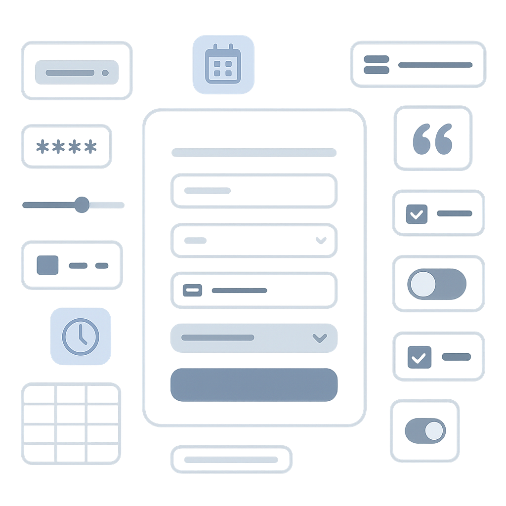
🛠️ 5. Built-in flexibility (like real-time previews & PDF export)
Modern forms need to do more than just collect answers. With responsive forms, you can:
- Export filled responses into PDFs (neatly, with page breaks!)
- Embed forms on websites that look perfect on mobile
- Integrate with tools like Zapier or Slack—yep, even from your phone
- Customize mobile behavior with JavaScript
- Set conditional redirects and confirmations based on input
- Unpublish automatically when submission limits are reached
- Add passcode protection to shared mobile form links
Common scenario: A field sales team submits forms from their phones, then exports the PDFs to cloud drives or CRMs—without touching a laptop.
Pro tips for mobile-friendly forms
| Tip | Why it matters | PlatoForms features |
|---|---|---|
| Keep forms short and clean | Long forms feel overwhelming on small screens | Multi-page forms, progress bars |
| Use clear labels | Clarity improves input accuracy and reduces errors | Smart field types |
| Test your form on a phone | Catches layout issues before users do | Instant preview |
| Use skip logic | Eliminate unnecessary questions | Conditional logic |
| Don’t overdo the media | Faster loading = better mobile experience | Lightweight designs, avoid large images |
| Use mobile helpers | Less typing, fewer mistakes | Dropdowns, date pickers, autocomplete, phone & country fields |
| Protect access | Prevents unauthorized edits or reuse | Passcode-protected links |
| Set time zones | Shows users time in their own context | Submission date/time zone setting |
| Redirect based on input | Creates tailored experiences | Conditional redirects and messages |
| Show conditional messages | Lets you respond based on user input | Logic panel + confirmation settings |
Bonus: Use PlatoForms’ instant preview to check your form on mobile in one click.
Want to go even further? Our AI can help you auto-build mobile-ready forms from your PDF. Just upload and tweak—it’s that easy.
FAQ: Mobile form best practices
Q1: What’s the easiest way to check if my form is responsive?
A: Use PlatoForms’ instant preview mode—test your layout on mobile, tablet, and desktop without publishing it.
Q2: Do I need a separate mobile form?
A: Nope! If your form is built with PlatoForms, it’s responsive by default. Design once, and it works everywhere.
Q3: Can I make an existing PDF form mobile-friendly?
A: Yes! Just upload your PDF to PlatoForms and convert it into a mobile-responsive online form using AI.
Try it for yourself
No account needed. Drag in your PDF or build a web form from scratch. It’s all mobile-friendly by default.


