

October 15th is National Form Abandonment Day! (okay, we totally made that up, but if you’ve ever rage-quit a 47-field application form, you know it should be a thing). We’ve all been there—you open a form, see a wall of text boxes, and immediately think “nope, not today.”
But here’s the thing: users don’t abandon forms because they’re lazy. They abandon them because our brains are literally protecting us from cognitive overload. Today we’re diving into the actual science behind why some forms feel like a breeze and others feel like filling out tax paperwork while riding a unicycle.
In this article, we explore why users abandon forms and how to fix it with cognitive load theory, visual hierarchy, and mobile-first design. You’ll learn practical ways to reduce form abandonment and create forms people actually want to complete. (Yes, that’s possible. No, we’re not delusional.)
Cognitive load theory: Your brain’s RAM is full
What’s cognitive load anyway?
Back in 1988, John Sweller figured out something pretty important: your brain works like a computer. It has limited processing power, and when you overload it, everything grinds to a halt. We’ve all experienced this—trying to follow GPS directions while having a phone conversation while remembering to pick up milk. Your brain just… stops.
Sweller identified three types of cognitive load:

- Intrinsic load: The actual mental work of understanding what you need to do
- Extraneous load: Extra brain work caused by terrible design (looking at you, forms from 2003)
- Germane load: Processing new info and connecting it to stuff you already know
Making this work in real forms
Reducing extraneous load (the easy wins):
-
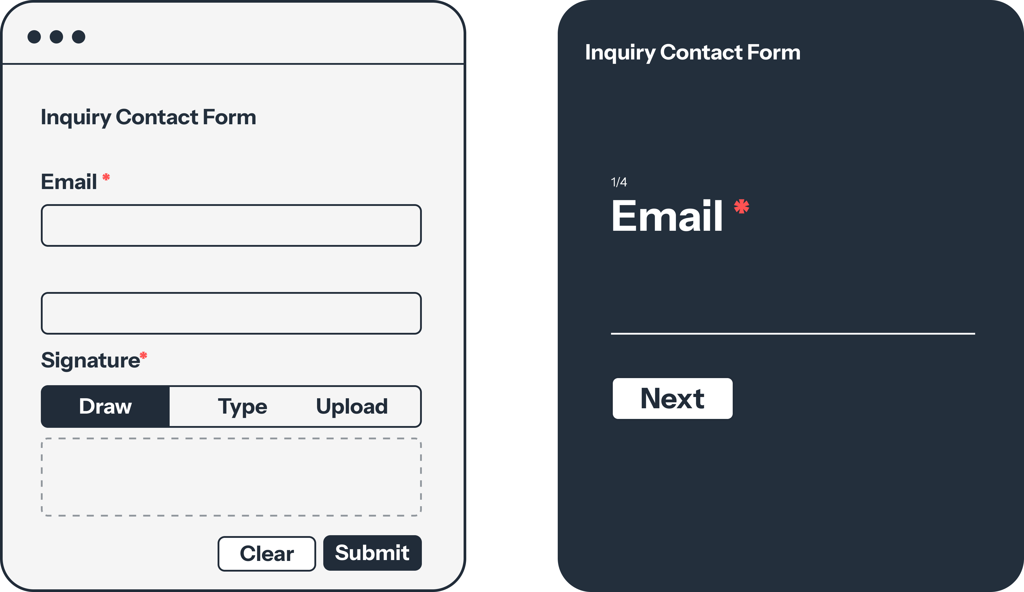
One question at a time approach
- Old school: Dump 50 fields on one page and pray
- Modern approach: Break it into digestible chunks, one topic per step
- Actual results: PlatoForms’ conversational form feature shows this bumps completion rates up by 23%
-
Be helpful, not cryptic
Terrible: Enter data
Actually helpful: Enter your phone number (we’ll text you a verification code) -
Cut down on extra typing
- Use Pre-fill to pull in details like name and email when they’re already logged in
- Add dropdowns instead of forcing people to type everything out
- Apply conditional logic so users only see questions that matter to them
Managing the inherent difficulty:
- Break scary tasks into “oh, that’s it?” moments
- Show progress bars (users love knowing they’re almost done)
- Replace jargon with human words
Visual Hierarchy: Where Eyes Go First
How humans actually look at screens
Spoiler alert: we don’t read forms like books. Eye-tracking studies show we follow predictable patterns, and smart designers use this to their advantage.
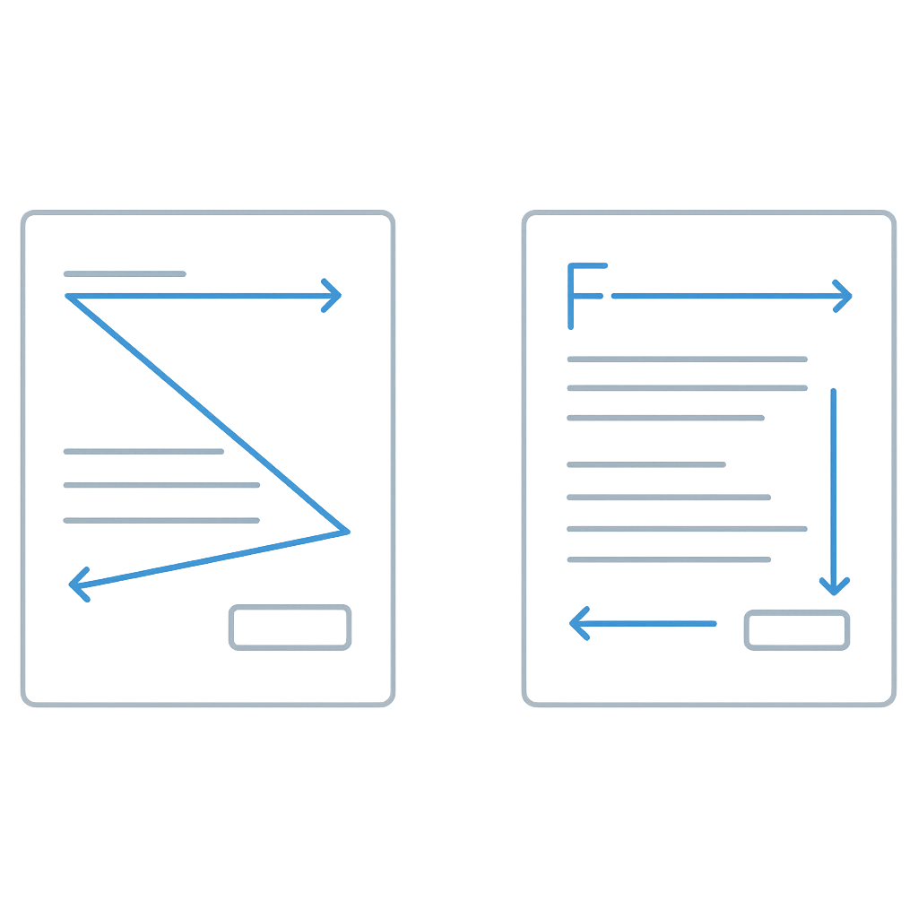
Z-pattern for desktop (most common):
- Top left corner (your main headline lives here)
- Top right corner (progress indicators, secondary info)
- Bottom left corner (where the real content starts)
- Bottom right corner (your “Submit” button’s happy place)
F-pattern for longer forms:
- Quick horizontal scan across the top
- Vertical scan down the left side
- Maybe another horizontal scan if something catches their eye
Putting this to work
Make importance obvious with visual weight:
Big Bold Title (24px, bold, dark)
Subtitle (18px, medium, gray)
Field Label (14px, bold, black)
Helper Text (12px, regular, light gray)
Colors that actually mean something:
- Red: “Oops, fix this” or “This field is required” (don’t overuse—it’s stressful)
- Green: “You got it right!” or “All good here”
- Blue: “Trust us” and “Click this button”
- Gray: “This is helpful but not critical”
White space isn’t empty space:
- 16px minimum between fields (your eyes need breaks)
- 32px between different sections (mental breathing room)
- 24px page margins (don’t cram stuff to the edges)
This isn’t being wasteful—it’s being kind to human brains.
Field order: The psychology of “Just one more thing”
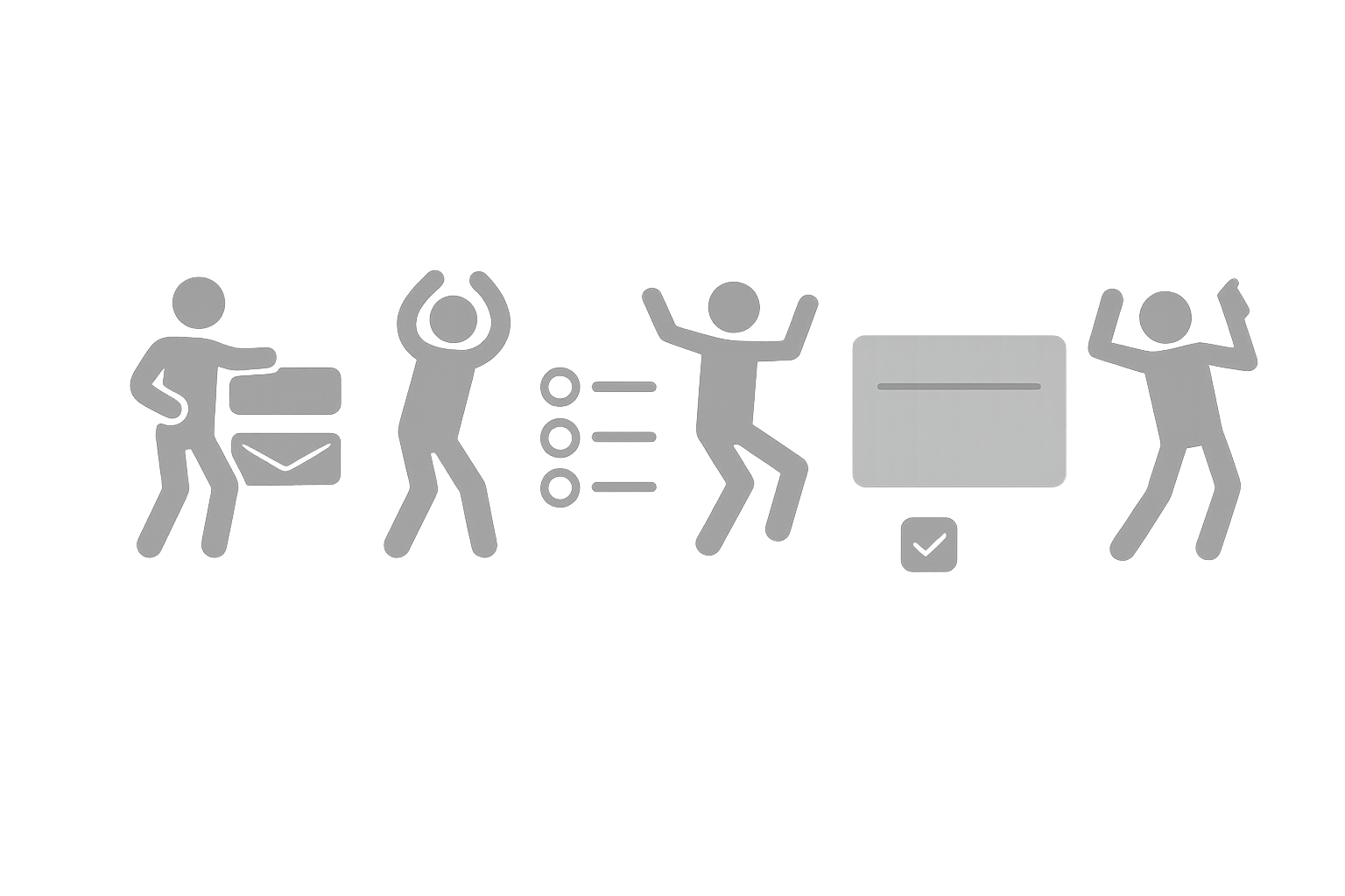
Start easy, get progressively bolder
Think of form completion like getting someone to dance at a wedding. You don’t start with the robot—you ease them in with some swaying, then build up to the good stuff.
The progression that works:
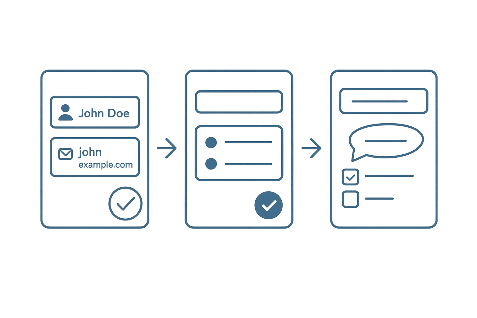
- Easy wins (name, email—stuff they know by heart)
- Simple choices (radio buttons, dropdowns)
- Things that require thinking (text areas, complex questions)
- The heavy asks (income, social security, firstborn child)
Group related stuff together:
- Basic personal info
- How to reach them
- What they want/prefer
- “Are you sure?” confirmation stuff
The numbers don’t lie
Baymard Institute studied 69 e-commerce checkout flows (because apparently someone has to). The results:
- Start with hard stuff: 68.7% abandonment rate (yikes)
- Logical grouping: 23.1% abandonment rate (much better)
- Save sensitive questions for last: 41% higher completion vs. asking upfront
Real-world success story:
Airbnb’s property listing form is basically a masterclass:
- “What type of place?” (easy multiple choice)
- “Where is it?” (address field with smart autocomplete)
- “How much do you want to charge?” (the scary money question comes last)
Result: 76% completion rate. For context, most forms hover around 23%.
Read More: 3 Reasons for Form Abandonment and 6 Steps to Bring Users Back
Mobile vs desktop: Different worlds, different rules
The mental context matters
Desktop users:
- Sitting down, focused, “I’m doing computer work” mindset
- Can see lots of information at once
- Typing is easy and fast
Mobile users:
- Standing in line, walking, “I have 30 seconds” mindset
- Tunnel vision—only seeing one thing at a time
- Every tap takes effort, typing is annoying
Design for the reality of the situation
Size things for actual human fingers:
Desktop: 36-40px tall fields work fine
Mobile: 44px minimum (Apple’s research, not opinion)
Optimize for lazy thumbs:
- More tapping, less typing
- Use the phone’s superpowers (camera for documents, GPS for location)
- Smart keyboard types (numbers for phone fields, @ symbol for email)
Information architecture changes:
Desktop: Can handle multiple columns of info
Mobile: Single file line, one thing at a time
Responsive design reality check
This isn’t about making the desktop version smaller. You need to completely rethink what matters most:
Desktop layout:
[Main Title Progress: 3/7 Need Help?]
[Question Label] [Input Field] [Helpful hint text]
Mobile layout:
[Main Title]
[Progress: 3/7]
[Question Label]
[Input Field]
[Helpful hint]
[Need Help?]
Three things you can fix today

Fix #1: The cognitive overload test
Before you unleash your form on the world, ask yourself:
- Can someone figure out what this page wants in 3 seconds?
- Would I be annoyed if I had to fill this out on my phone while standing up?
- Do my error messages actually help people fix problems?
- Did I add any “design elements” that are just making things harder?
Fix #2: The 5-second reality check
Grab literally anyone (your coworker, your neighbor, your mom) and show them your form for exactly 5 seconds. Then ask:
- What is this form trying to accomplish?
- What would you need to do first?
- How long do you think this would take?
If you get wildly different answers, your design is confusing people.
Fix #3: Design mobile-first (even for desktop)

Start with the mobile version, even if most users will see it on desktop:
- Forces you to be ruthless about what’s actually important
- Makes the interaction flow bulletproof
- Guarantees it works everywhere
Plus, designing mobile-first usually results in cleaner desktop experiences too.
The real talk
Form design isn’t about making things pretty (though that doesn’t hurt). It’s about respecting the fact that people are busy, distracted, and have about 47 other things they’d rather be doing.
Here’s the golden rule: Every single field is you asking someone to stop their day and give you their attention. Make sure you deserve it.
Next time you’re building a form, try this thought experiment: imagine filling it out while your coffee is getting cold, your phone is buzzing with notifications, and you really need to get to your next meeting. Would you actually finish it?
If the answer is no, you know what to do—start for free and see how much easier your forms can be.
Quick answers to big form problems
Practical tips on cognitive load, mobile-first design, and reducing form abandonment.
Q1: Why do users abandon forms?
Users often abandon forms because of cognitive overload, unclear instructions, or too many fields that feel unnecessary.
Q2: How can I reduce form abandonment rates?
Simplify your forms with fewer fields, use pre-fill or autofill where possible, and show progress indicators so users know how much is left.
Q3: What is cognitive load in form design?
Cognitive load refers to the mental effort required to process information. In form design, reducing extra distractions makes it easier for users to complete tasks.
Q4: Should I design forms for mobile or desktop first?
Design mobile-first. Mobile screens force you to prioritize what’s important, and the result usually creates a cleaner experience on desktop as well.
Q5: What’s the best way to improve completion rates quickly?
Start with small wins: pre-fill user info, group related questions, and move sensitive or complex fields to the end of the form.


