


You click a registration link. The event looks interesting—maybe worth your evening.
Then the form loads.
Name. Last name. Job title. Company name. Company size. Industry. Phone number. How did you hear about us? What are your main pain points? Please rate your current solution on a scale of 1–10.
You close the tab. You don’t know exactly why. The form wasn’t broken. Nothing went wrong. You just… stopped.
This happens millions of times a day, and the people who built those forms have no idea. The analytics show a drop-off. The reason stays invisible.
The problem usually isn’t length. It’s that the form violated a social contract you didn’t know existed—the same one that stops you from asking a stranger for their salary thirty seconds after introducing yourself. Forms have social logic too. When that logic breaks, users leave without a word.
Here’s what that logic looks like in practice, and how to fix it.
On this page
1. The “First Date” Rule: Reduce Cognitive Load
Why do we still design forms that show 20 empty fields at once—and then wonder why users don’t finish them?
Research consistently shows that forms with more than five required fields see abandonment rates climb sharply—and most users won’t tell you why they left. When a user lands on a dense wall of input boxes, their brain doesn’t think “I’ll just work through these one by one.” It calculates the total effort ahead, decides it’s too much, and looks for the exit. Psychologists call this cognitive overload: when the cost of continuing feels higher than the reward of finishing.

The irony is that the form might only take three minutes to complete. But if it looks like it will take fifteen, most users won’t find out.
Human observation: A good conversation starts with a simple “hello,” not a five-page contract. You earn the right to ask harder questions by making the first ones easy.
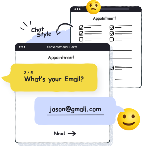
The fix: Use Conversational Mode. By showing one question at a time, you remove the cognitive weight of “how much is left.” Users stay focused on the question in front of them—not the eleven still to come. The form doesn’t get shorter; it just stops feeling long.
In PlatoForms, switching to Conversational Mode takes one click in Preview & Design. Your existing fields, logic, and integrations stay exactly the same—only the presentation changes.
Read more: Why Most Forms Fail: The Case for Conversational Design
2. Give and Take: Building Trust with Small Wins
Have you ever paused mid-form when it asked for your phone number—and wondered whether you actually needed to give it?
That pause is a defense reflex. Asking for sensitive information—a phone number, a home address, payment details—triggers a moment of recalculation. Is this worth it? Do I trust this enough to continue? For many users, that moment is where they stop.
The antidote isn’t to avoid collecting that information. It’s to make the exchange feel fair. When a form gives something before it takes something, users are far more likely to keep going.
Human observation: Trust is built through reciprocity. If you ask for something, show immediately that you’re providing something in return.
The fix: Enable Address Autocomplete. When a user starts typing their address and sees verified suggestions from Google Maps appear, something shifts. The form is no longer asking them to do work—it’s doing the work with them. Street, city, state, and postcode fill automatically from a single selection.
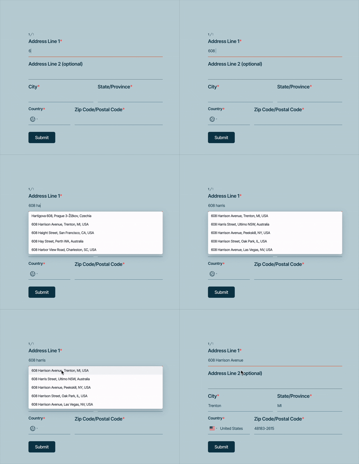
The practical benefits are real: fewer typos, no failed deliveries, cleaner data. But the psychological effect matters just as much. The form feels like a tool that’s on the user’s side—not a system they’re feeding data into.
Read more: Address Autocomplete in PlatoForms
3. Respect Boundaries: Use Logic to Stay Relevant
Have you ever been asked for your company registration number on a form clearly meant for individual customers? Or answered five questions about a service you just said you don’t need?
Whenever a form asks questions that clearly don’t apply to you, it stops feeling like a registration and starts feeling like an interrogation. It’s a signal the form wasn’t built for you—it was built to collect data, and you just happen to be filling it out. It’s the form equivalent of an interviewer who asks the same scripted questions regardless of what you just said. It communicates, clearly, that no one is listening.
Human observation: A good listener adjusts their next question based on your last answer. They don’t ask about your shipping preferences if you just selected “digital delivery.”
The fix: Use Conditional Logic. If a user selects “No” for a service, hide every follow-up question about that service. If they indicate they’re an individual rather than a business, skip the company fields entirely. Show only what’s relevant to this user, based on what they’ve already told you.
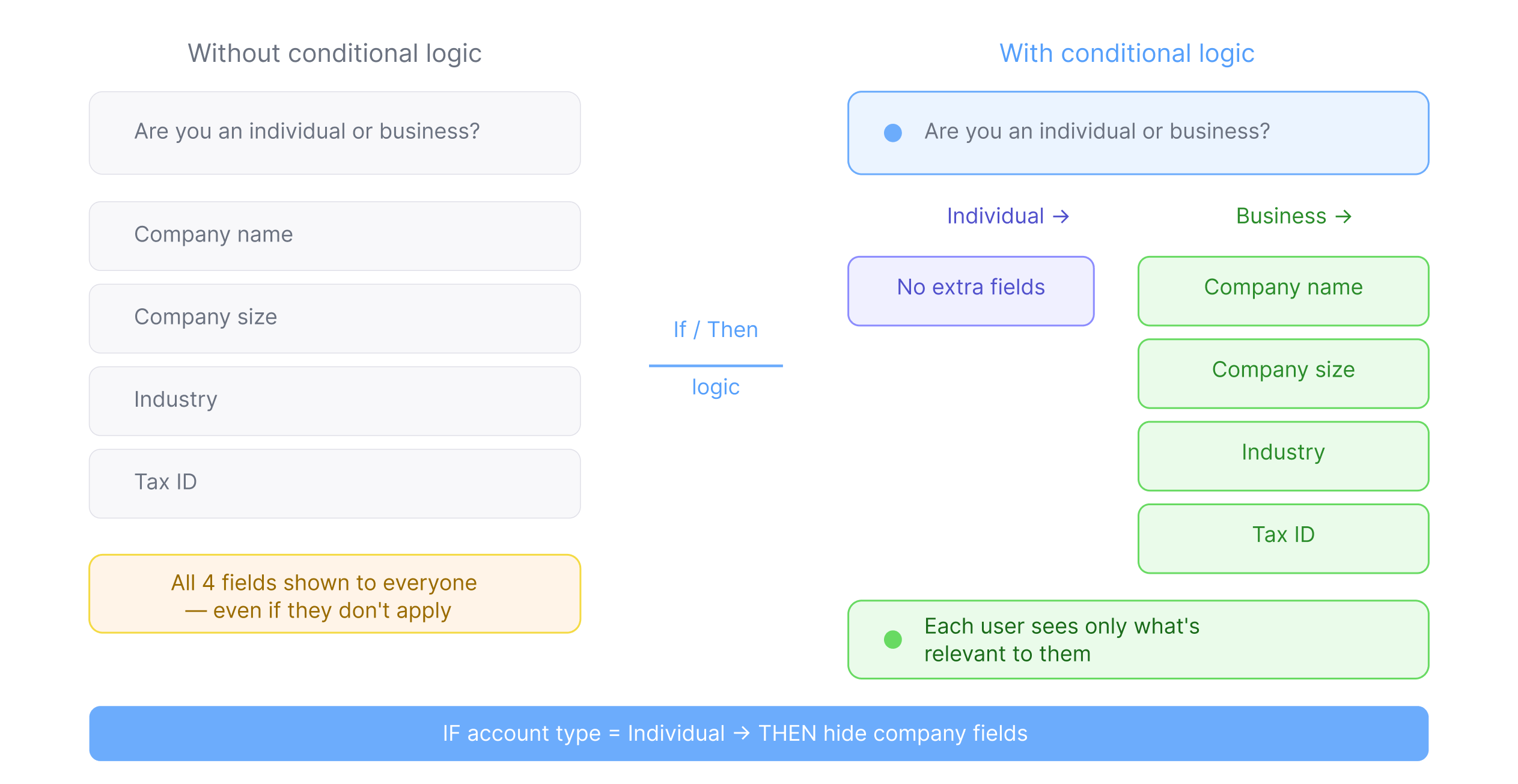
Hiding irrelevant fields isn’t just a UX best practice—it’s a signal of respect. It tells the user: we were paying attention. That sense of being heard is one of the most powerful trust signals a form can send, and it costs you nothing to implement.
In PlatoForms, logic rules follow a simple If/Then structure. No coding required.
Read more: How to Add Conditional Logic to Online Forms
4. The “Dopamine” Finish: End with Clarity, Not Silence
Most forms end with a blank “Thank you” page. The user clicks submit, sees a generic confirmation, and the experience just… stops.
Why do we still do this, when the moment of completion is the single best opportunity to build trust?
Completing a task triggers a small release of dopamine—the brain’s reward signal. But that reward is amplified when it comes with certainty. Did it go through? What happens next? When will I hear back? A generic “Thank you” answers none of these. It leaves users in a quiet limbo that erodes exactly the trust your form just spent several steps building.
Human observation: A milestone deserves acknowledgment. “You did it” lands differently when it comes with a clear next step—not just a period at the end of a sentence.
The fix: Replace the default thank-you message with one that does three things: confirms what was submitted, tells the user what happens next, and sets a clear expectation for timeline. In PlatoForms, you can customize the thank-you message or redirect link for each form—and use conditional logic to show different messages based on what the user selected.
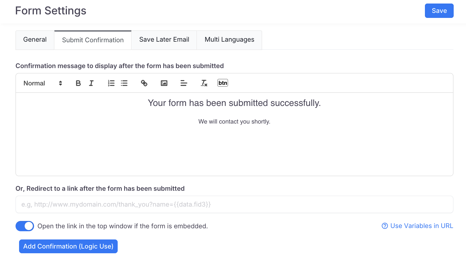
A well-written confirmation sounds like a person, not a system:
“We’ve received your application. Our team will review it and get back to you within 2 business days. Keep an eye on [email].”
If your form serves different audiences—say, individuals vs. businesses, or students selecting different majors—you can set up multiple thank-you messages and use logic to show the right one to each user.
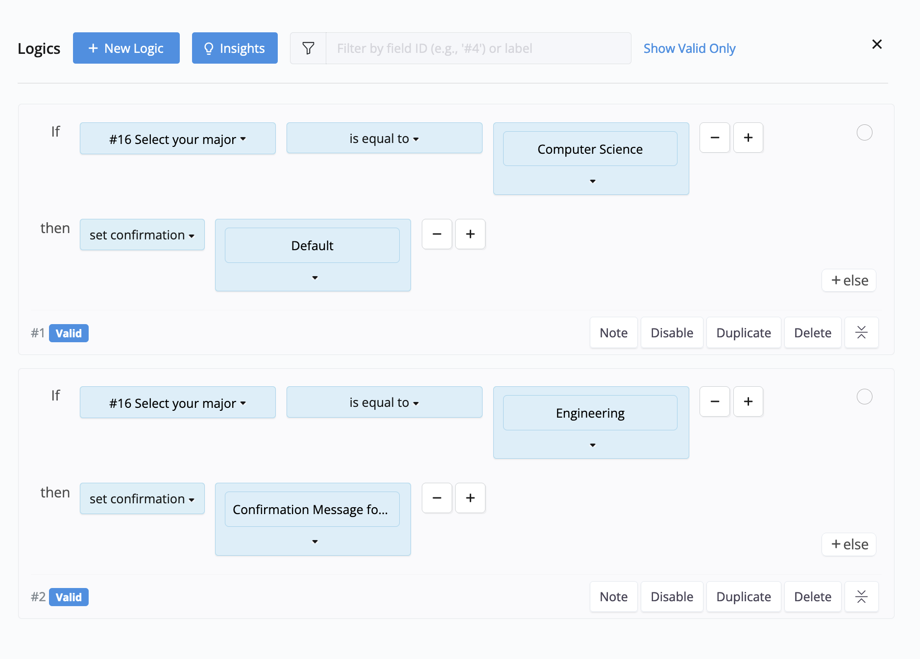
On your end, every submission also generates a clean, formatted PDF—ready to file, forward, or act on without manual reformatting.
The difference between a form that ends in silence and one that says “here’s what’s next” is the difference between a transaction and an experience.
5. Smooth Checkout: Transparency over Anxiety
The payment step is where most forms lose users—not because people have changed their minds, but because of transaction anxiety: the fear that the final number will be different from what they expected.
Why do we still design payment flows where the total only appears at the very end? It’s the online equivalent of a restaurant that doesn’t list prices on the menu. Even if the amount is exactly what you’d expect, the lack of transparency creates doubt. And doubt, at the payment stage, kills conversions.
Human observation: Surprises at checkout don’t feel like surprises—they feel like tricks. The form that shows you what you’re about to pay, as you make decisions, is the form users trust.
The fix: Use dynamic pricing with Stripe or PayPal. When the price updates live as the user selects options—size, quantity, plan tier, add-ons—there are no surprises at the end. By the time they reach the payment step, they’ve already watched the total form in real time. They’re not discovering the price; they’re confirming a decision they’ve already made.
PlatoForms supports dynamic pricing for both Stripe and PayPal through a simple form logic setup—no custom development required.
Read more: How to Add PayPal Payment to an Online Form · Using Stripe for Payment Forms with PlatoForms
The common thread
Look at each of these fixes and a pattern emerges. Every one of them is answering the same question: does this form feel like it was built for me, or built to process me?
Conversational Mode mimics the rhythm of real conversation. Address Autocomplete feels like a helpful nudge from a knowledgeable guide. Conditional Logic signals that someone was actually listening to your last answer. PDF confirmation gives a sense of real closure. Dynamic pricing removes the fear of the unknown.
None of these are radical changes. Some are a single click. But together, they shift the experience from interrogation to exchange—and that shift is what determines whether users complete your form or abandon it halfway through.
The best forms feel like a two-way exchange: not “give us your data,” but “let’s figure out together if this works for you.”
Start with a template
The fastest way to build a form that respects your users is to start from a structure that already does.
Browse our 2,000+ templates—from payment forms to registration forms to donation forms—and add the features above in minutes, not hours.
Great form design is invisible. It doesn’t feel like an interrogation. It feels like someone who already knew what you needed—and made it easy to say yes.


