
Hey, form builders and workflow wranglers! We’ve all opened a form that looks like a wall of boxes and thought, nope, not today. Long forms are boss fights. No save point. Most people quit halfway.
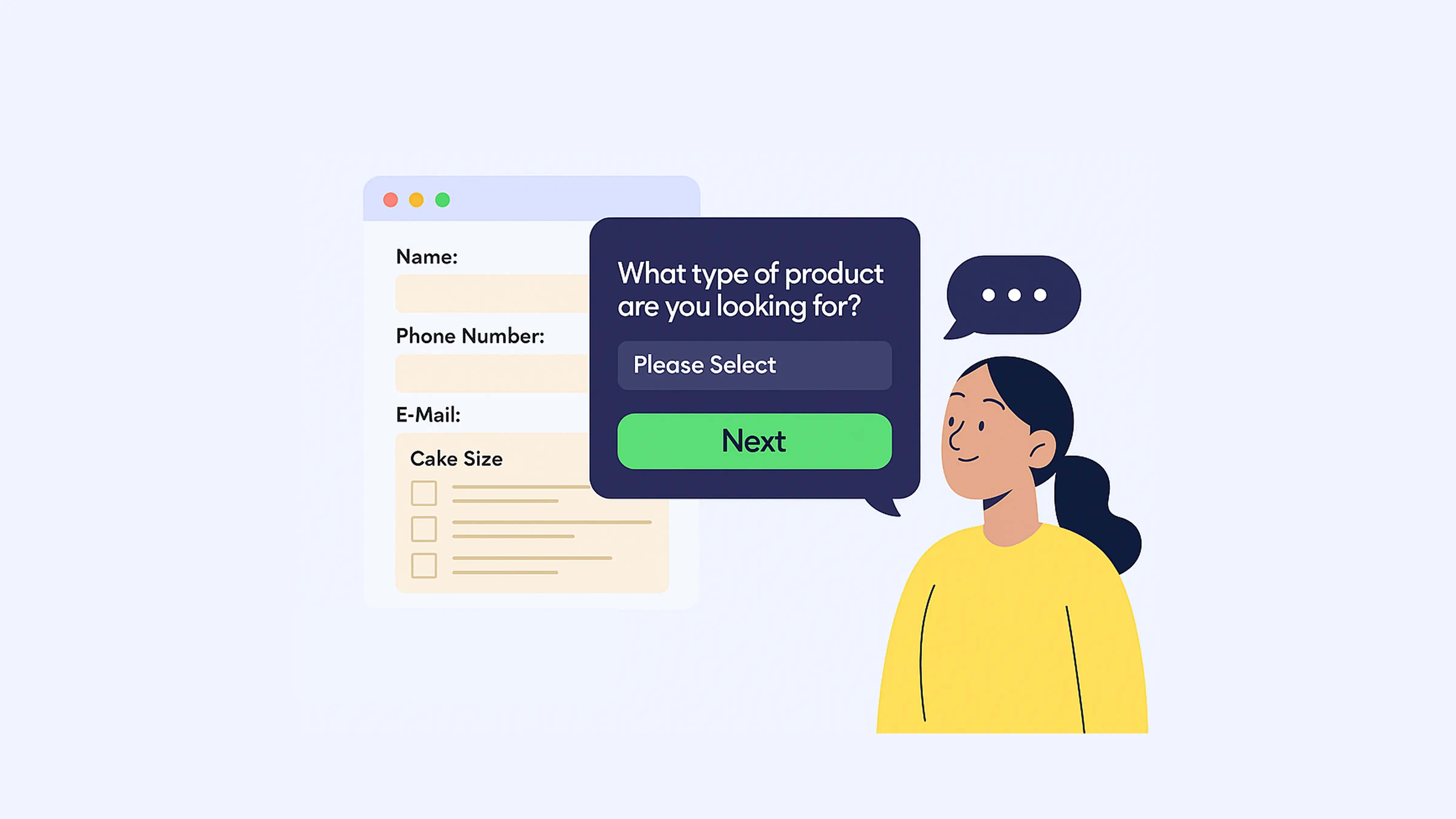
Good news: you don’t have to make people suffer. With PlatoForms’ Conversational Form, you can turn big, scary forms into a chat. One question at a time. It guides people to the right product, plan, or service.
Think of it like a shop assistant. Friendly. Never tired. Never judgy.
Let’s build a product or solution recommendation form, step by step.
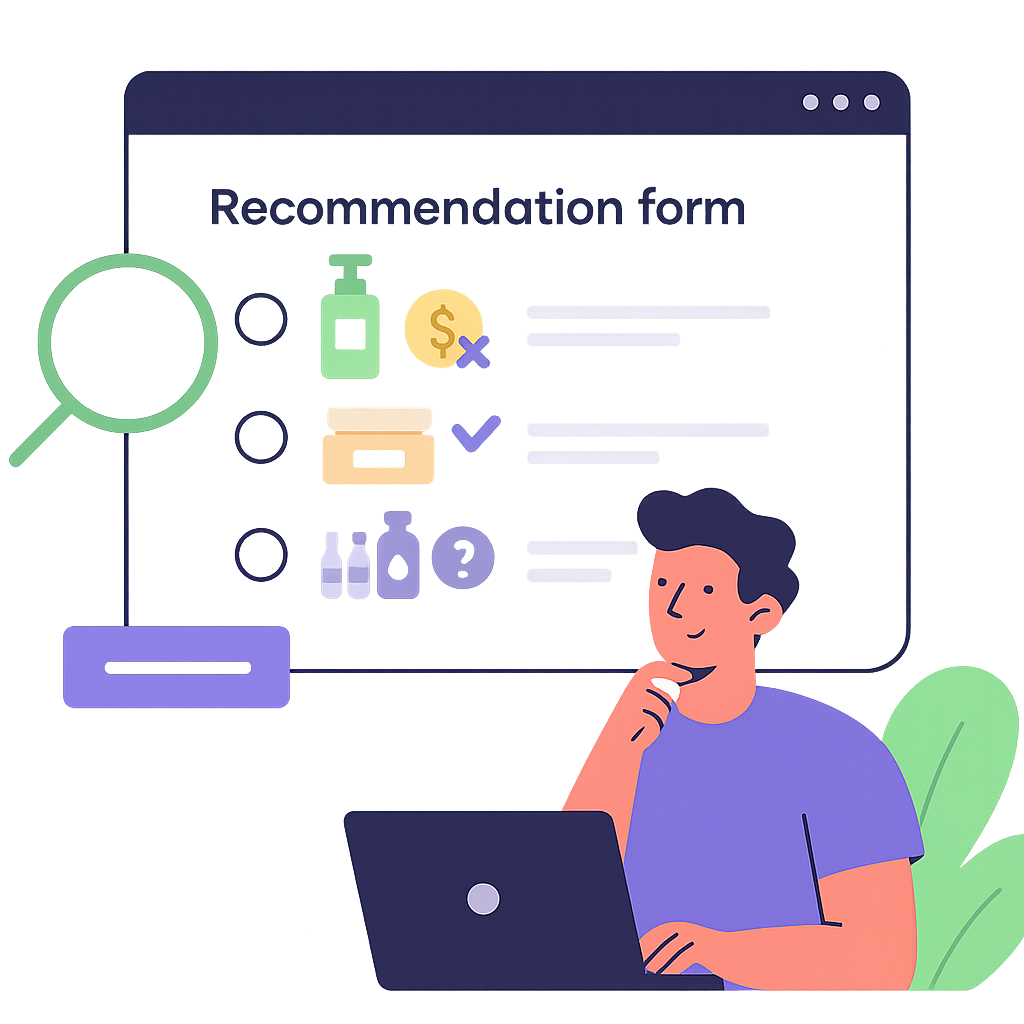
Why even bother with recommendation forms?
Because they actually solve problems:
- Too many options? Users get decision overload. Recommendation forms cut through the noise.
- Trust issues? By explaining why you recommend something, users feel understood, not sold to.
- Messy data? Each answer gives you structured info to segment and follow up.
- Works anywhere. Skincare shops, SaaS tools, education programs, even healthcare.
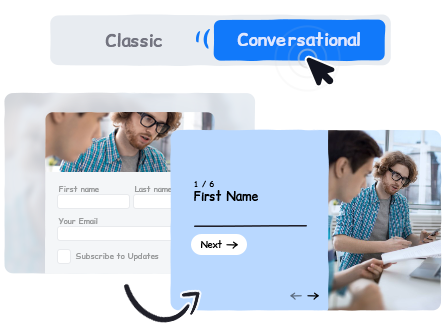
What’s Conversational Form anyway?
Released in August 2025, Conversational Form is PlatoForms’ way of making forms less like homework and more like a conversation.
- One question per screen (no overwhelm).
- Works for web forms, PDF forms, and workflows.
- Supports themes, logic, and multi-language.
- Mobile-friendly by default.
Building your first recommendation form (the fun part)
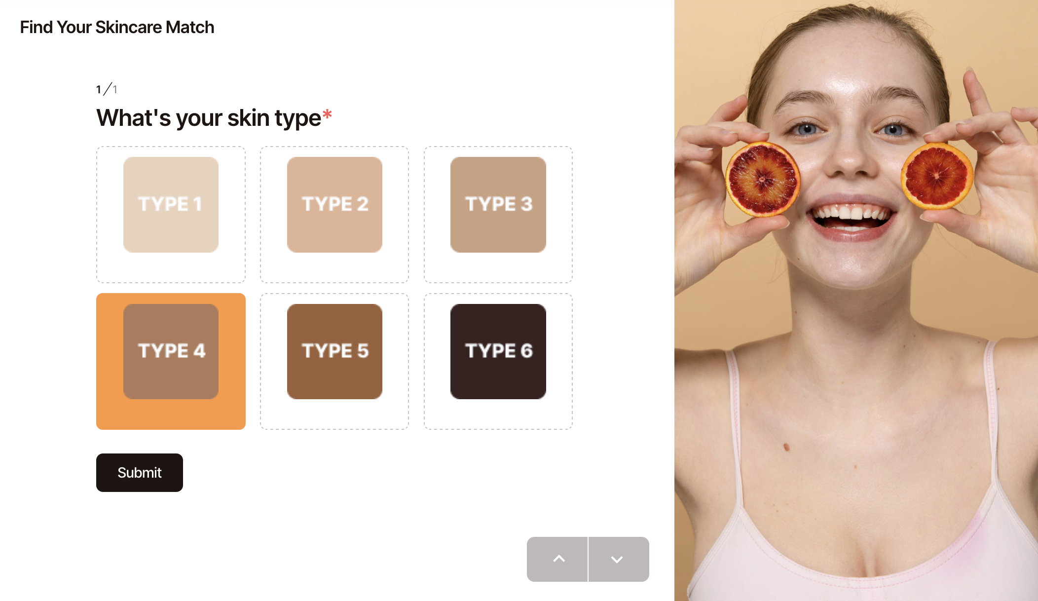
1. Plan your questions (aka: don’t wing it)
Start by listing the traits that actually affect recommendations.
- Skincare → skin type, routine, budget
- SaaS → team size, integrations needed
- Education → learning goals, weekly hours
💡 Pro tip: Keep each screen focused on one thing. Nobody wants a pop quiz.
2. Add fields people want to answer
Choose question types that don’t feel like extra work:
- Multiple Choice → preferences
- Dropdown → categories
- Picture Choice → visual options (best for mobile)
3. Build logic paths (because one-size-fits-all doesn’t)
Use the Logic panel to skip or branch questions.
- Beginner? → skip advanced stuff.
- Team > 50? → show enterprise plan.
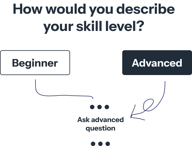
💡 Pro tip: Start small. You don’t need a logic maze that looks like a subway map on day one.
4. Personalize the result
Here’s where the magic happens:
- Static Text with dynamic fields
“Because you selected [Oily Skin], we recommend [Oil-Control Set].”
- Conditional redirects → Different product pages for different users.
5. Make the next step brain-dead simple
Nobody wants to stop at “Congrats, you’re an Oily Skin Type.” Give them a next step:
- Redirect to checkout or product page
- Trigger Stripe payment
- Send a pre-filled PDF quote
- Sync data to your CRM via Zapier/Make
Extra polish (small wins, big impact)
-
Keep it short: 5-8 questions is the sweet spot.
-
Multi-language support: International users love you for it.
-
Preview often: Use Instant Preview to catch issues early.
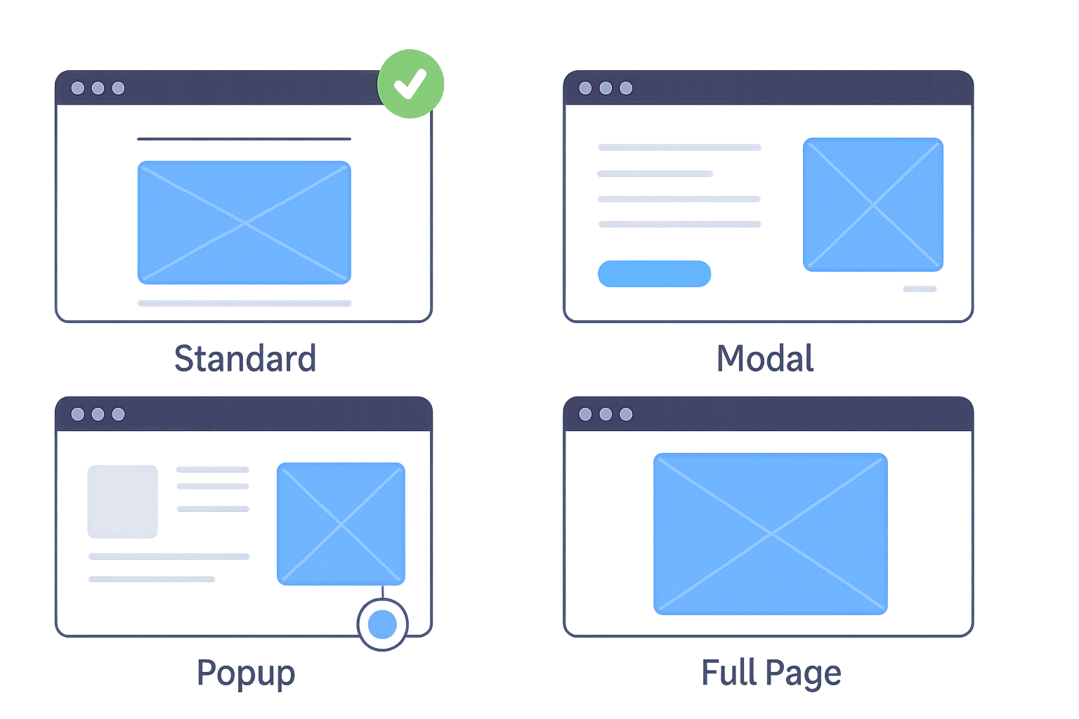
-
- Popup on product pages.
- Full page for landing pages.
- Modal for campaigns.
Example playbooks (steal these)
-
E-commerce skincare finder
- Ask about skin type and routine.
- Redirect to a product set.
-
B2B SaaS plan selector
- Ask about team size and integrations.
- Redirect to pricing tier or consultation booking.
-
Education course recommender
- Ask about goals and study time.
- Show course suggestions in Static Text with links.
Wrap it up
Forms don’t have to feel like tax paperwork. With Conversational Form, you can:
- Help users decide faster
- Give personalized recommendations
- Turn answers directly into purchases, sign-ups, or workflows
Go ahead—build your first conversational recommendation form. And if you catch yourself smiling while testing it… hey, that’s allowed.
Read more: Why Most Forms Fail: The Case for Conversational Design


