Set Table properties
Tabs
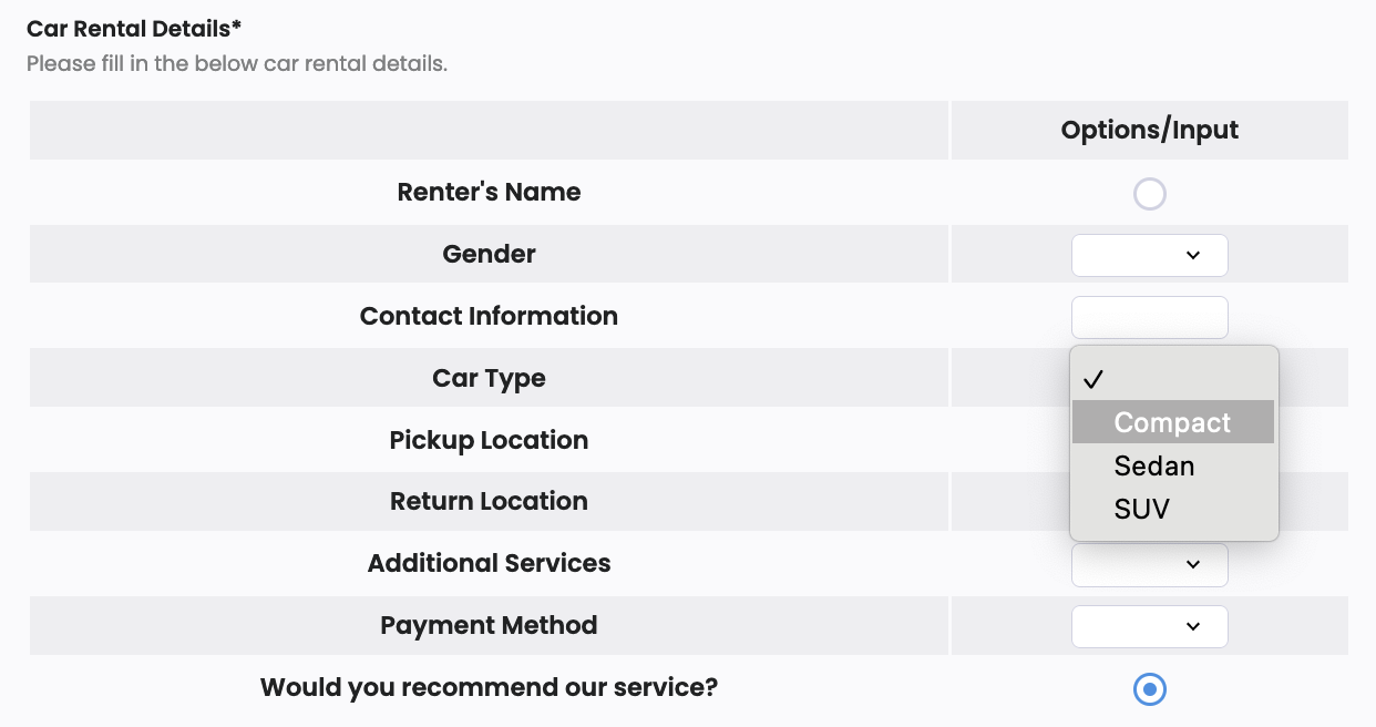
A Table field has cells in rows and columns. It’s flexible, letting users neatly put in, compare, and organize various info. It’s handy for surveys, making selections, and entering lots of details.
Table field is only available in web PDF forms.
Add field
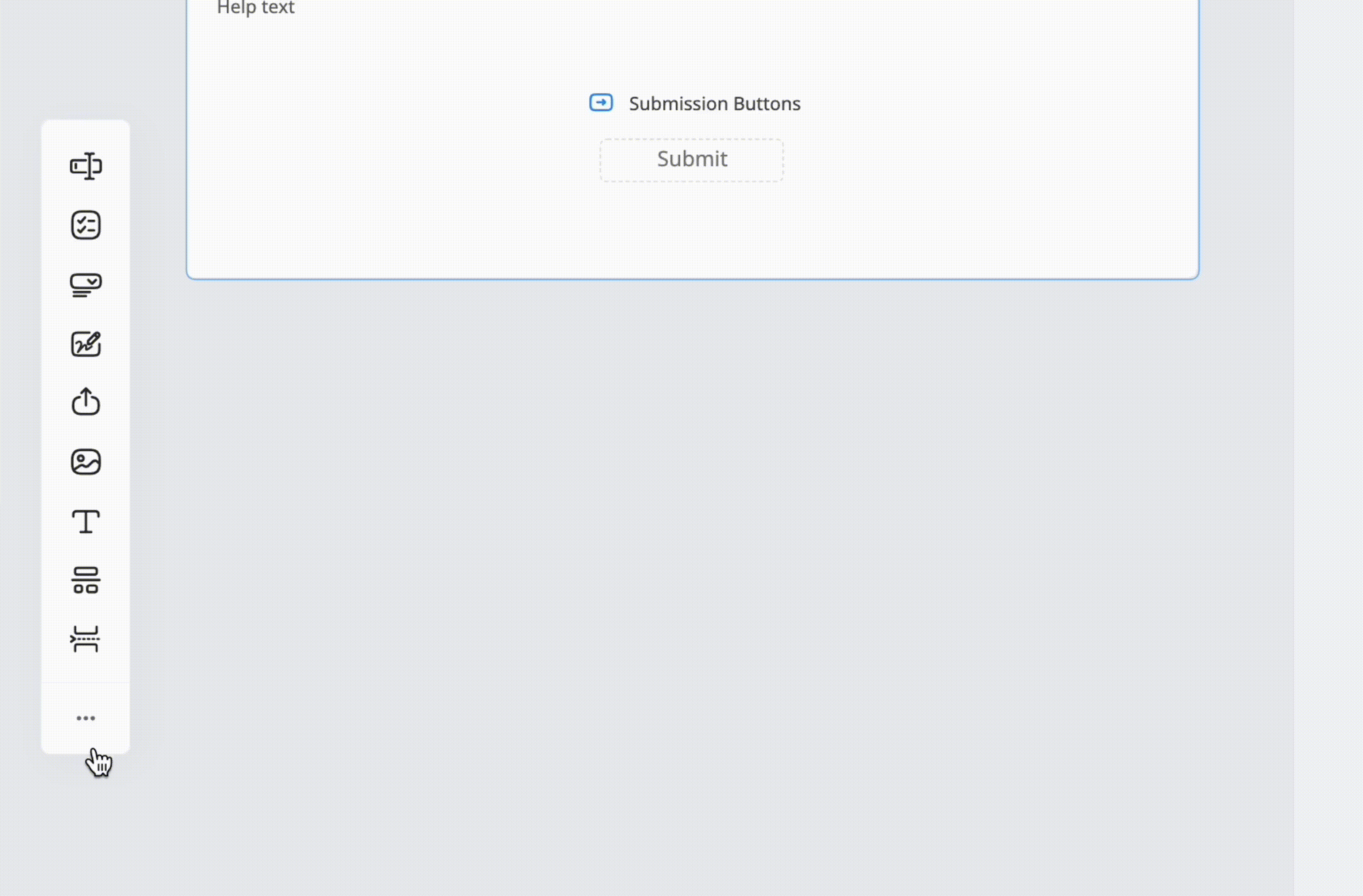
To add a Table field, in the left Toolbar, click the small ••• icon, and select Table.
Access field properties
-
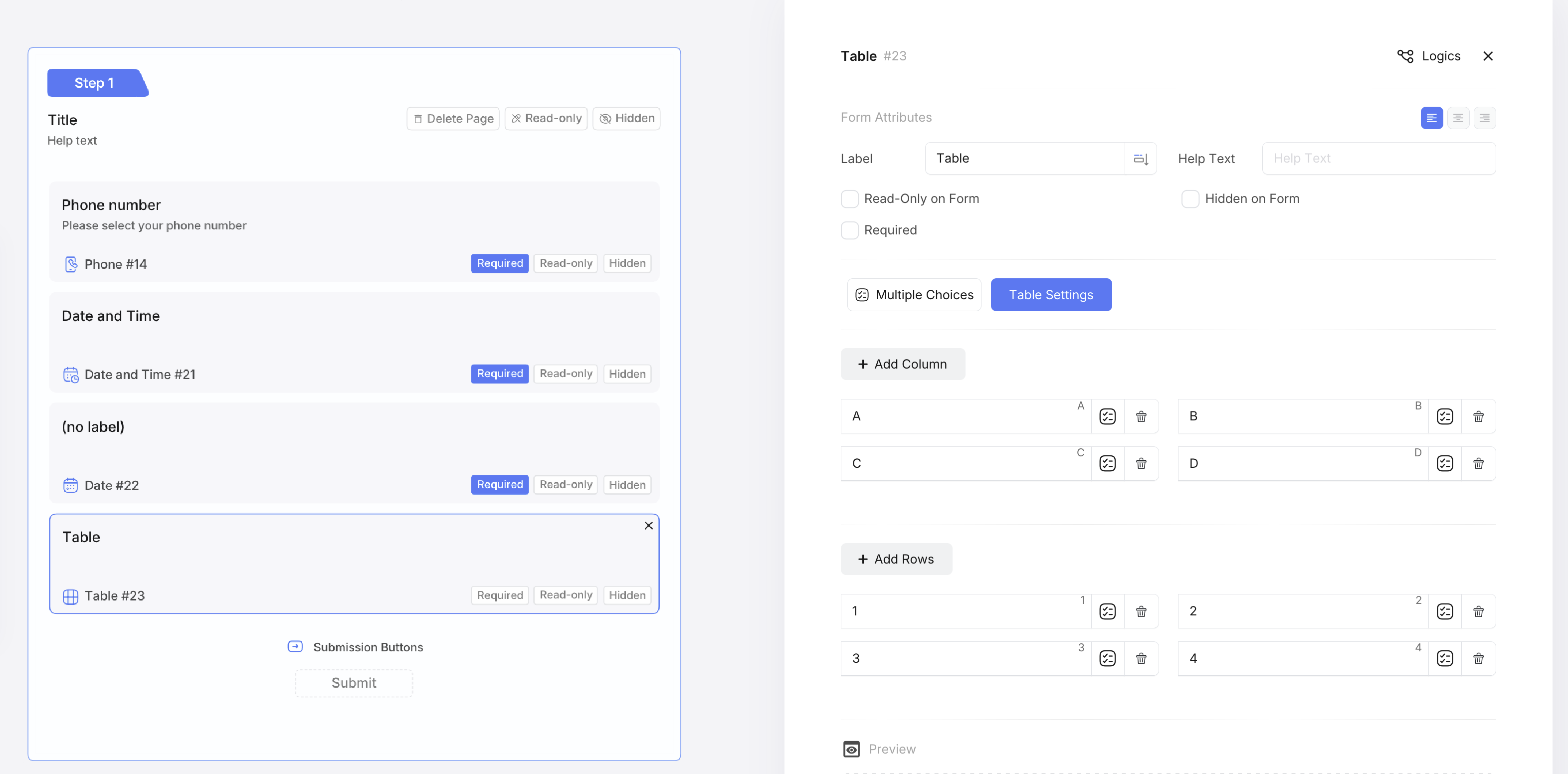
Click the Field Label or ID to open its properties panel.
-
In the properties panel, configure the field properties.
Configure field Properties
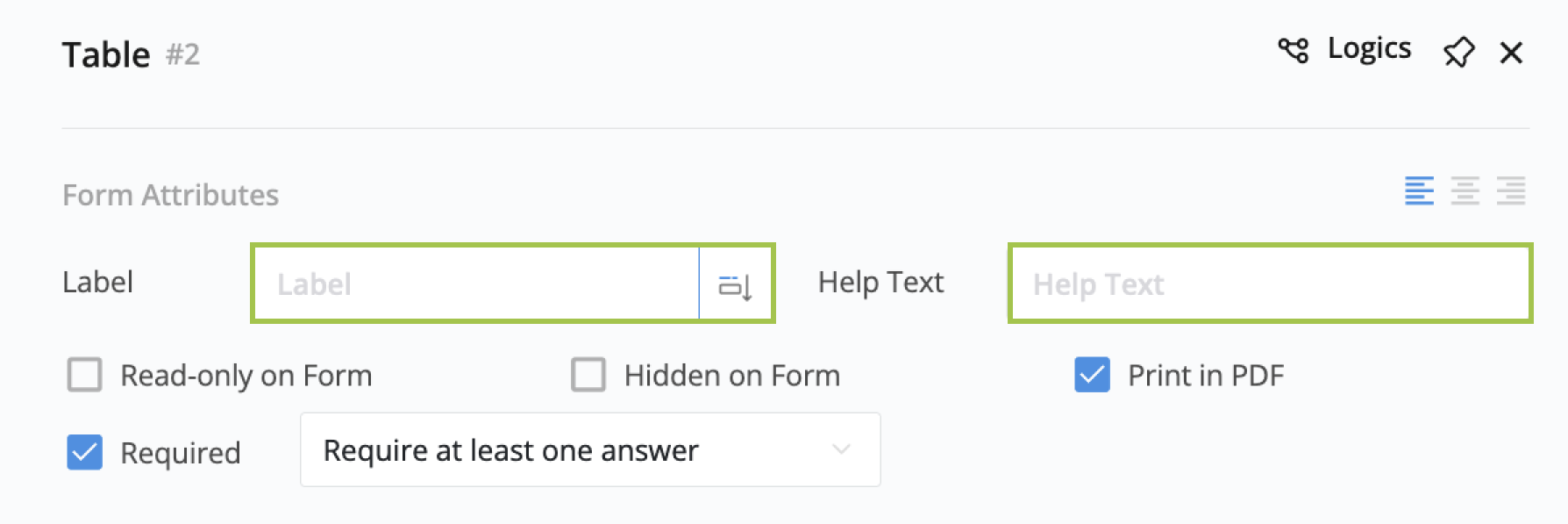
Set Label and Help Text
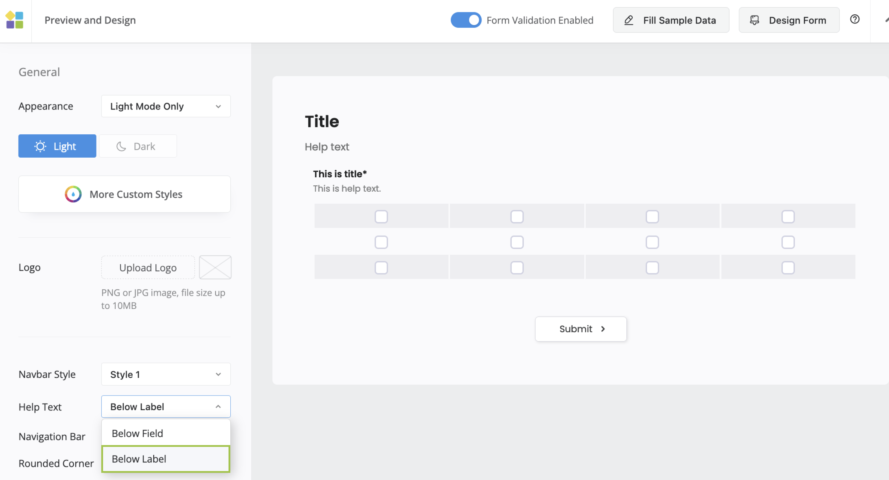
The Label serves as the title of the table, and the Help Text provides additional information for better understanding.
By default, Help Text is positioned below the table, but you can relocate it under the title by selecting Below Label in the Form Design settings.
Set as Required
When checked as “Required”, filling in the table is mandatory. Your options for the “Required” setting are as follows:
- At least one cell must be completed.
- At least one cell per row is required.
- At least one cell per column is required.
- Each cell needs to be filled in.
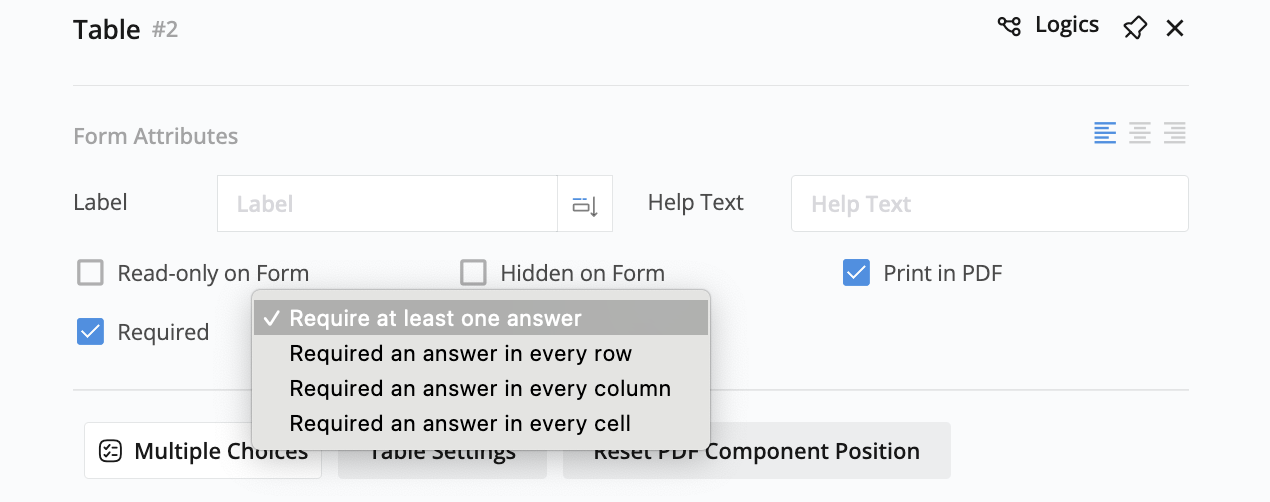
When using row/column selection with Required settings, the requirement applies to the actual cell selections, not the row/column checkboxes.
Configure columns and rows
Upon adding a table, it initiates as a default 4x3 table. However, you can modify its size by adding or deleting rows and columns.
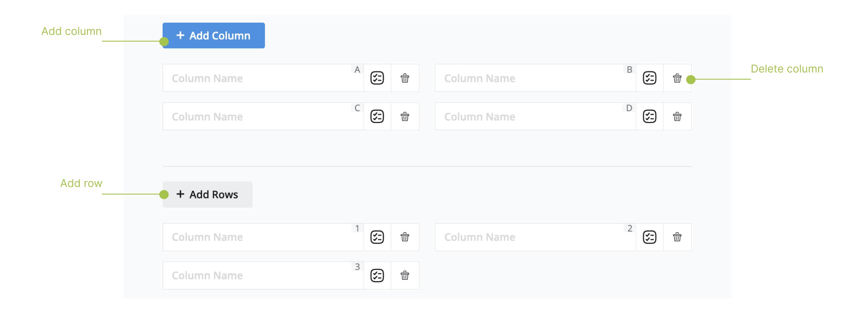
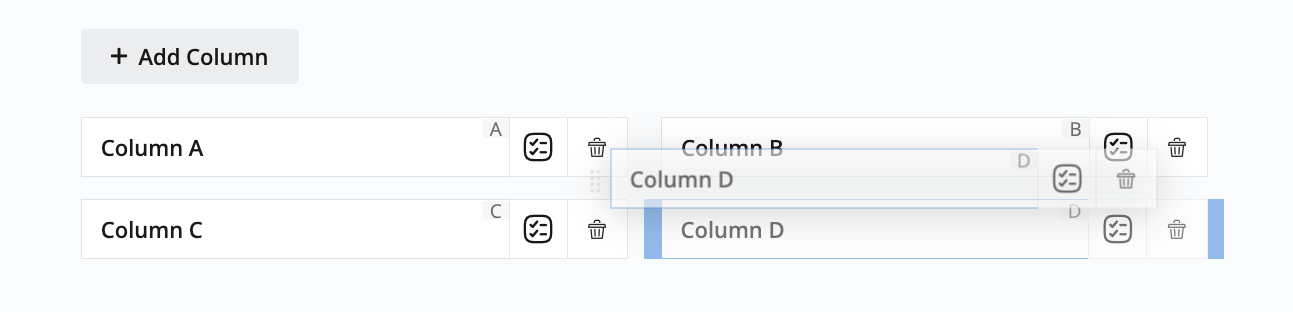
Additionally, you can rearrange the order of a specific cell in a row or column through a drag-and-drop action.
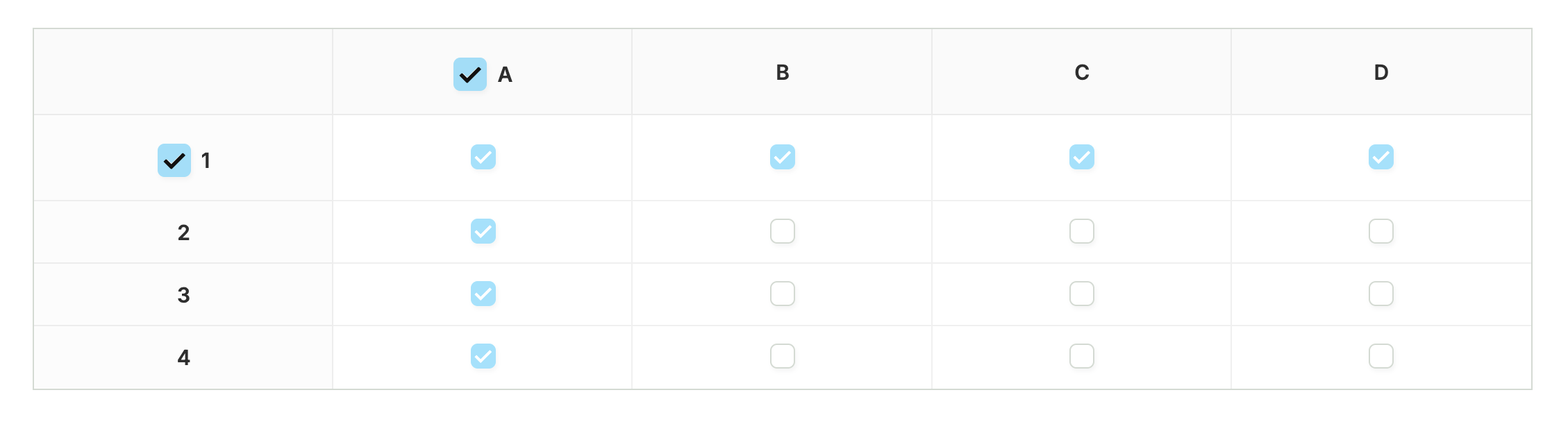
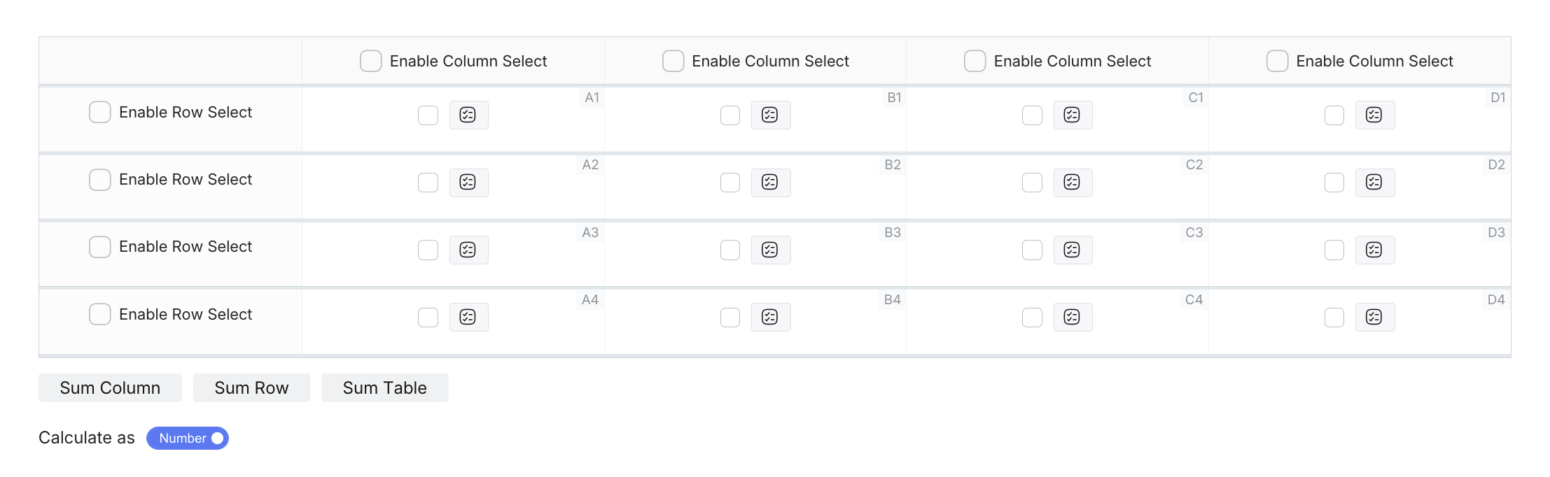
Enable Column and Row Selection
Configure smart selection options to let users select entire rows or columns with one click for faster data entry.
To enable selection:
-
Click on the Table field to select it and open the properties panel.
-
In the properties panel, click Table Settings.
-
Navigate to the Detail Settings tab, and configure your selection options:
- Enable Column Select: Check the box above each column you want to make selectable.
- Enable Row Select: Check the box next to each row you want to make selectable.
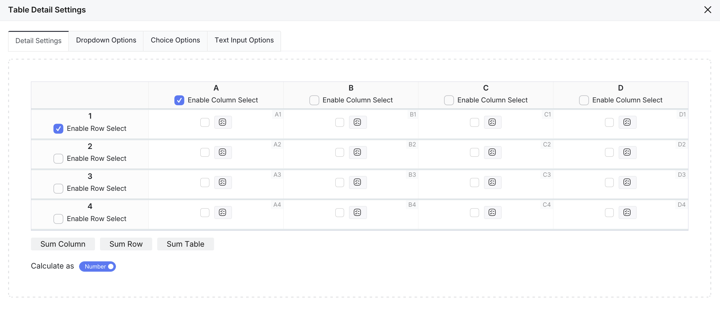
How it works:
- Column selection: When users click a column header checkbox, all cells in that column are selected.
- Row selection: When users click a row header checkbox, all cells in that row are selected.
- Mixed selection: Use both row and column selection together for maximum flexibility.
- Manual selection: Users can still select individual cells as needed.
You can enable column selection for specific columns while keeping others non-selectable for better user experience.
Customize cells
-
Global Setting: Choose from four types for all cells: Single Choice, Multiple Choices, Dropdown, and Text Input.
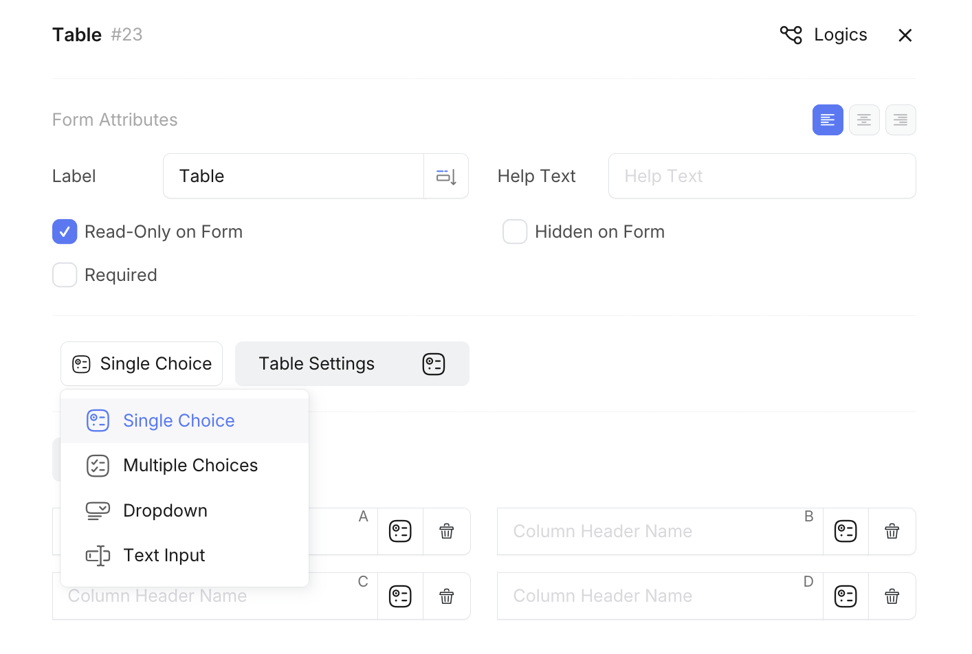
-
Individual Setting: To customize individual cells, click the icon next to the cell to open the cell type menu. Select from the available options:
- Single Choice: Radio button selection
- Multiple Choices: Checkbox selection
- Dropdown: Dropdown menu selection
- Text Input: Free text entry
- Calculation: Automatic calculation cell (displays fx icon) - Only available for individual cells
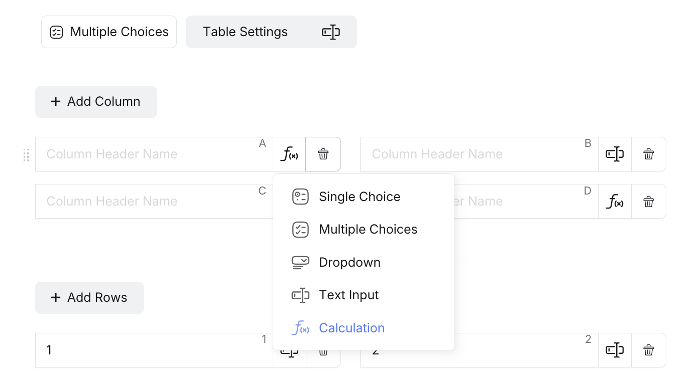 Tip
TipCalculation cells automatically generate formulas based on their position and the enabled calculation options (Sum Column, Sum Row, Sum Table). This cell type is only available when customizing individual cells, not as a global setting.
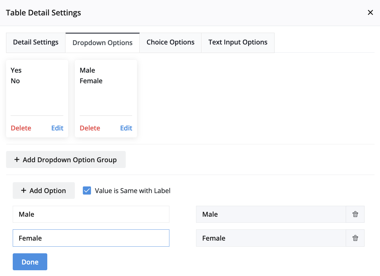
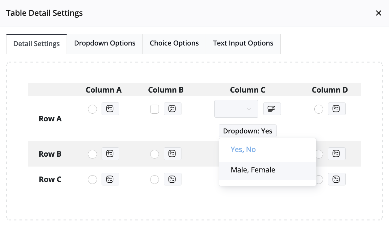
Configure Dropdown Options
To configure options for a “Dropdown” cell:
-
Click Table Details Settings, navigate to the Dropdown Options tab, and then click Add Dropdown Option Group.
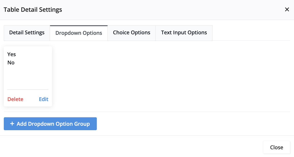
-
In the newly created group, click Edit to add specific options.
-
Go to the Details Settings tab, select the dropdown cell, and assign the desired Dropdown Option Group.
Set Group Options
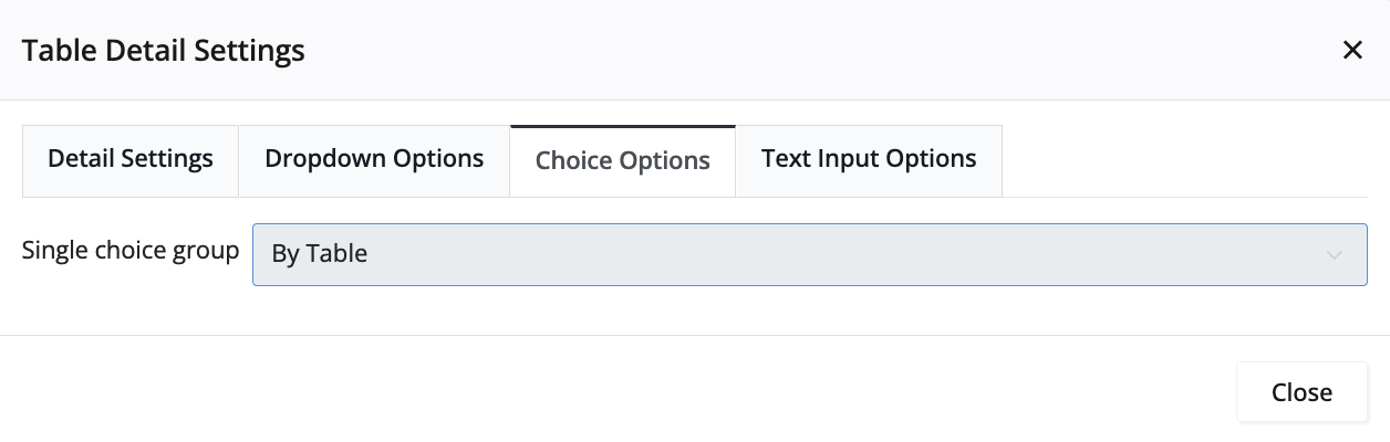
When dealing with a “Single Choice” cell, navigate to the Choice Options tab within Table Settings. Here, you can group options for the entire table, each row, or each column. This configuration ensures that respondents can select only one option for the entire table, each row, or each column.
Set Text Input Options
For a “Text Input” cell, access the Text Input Options tab in Table Settings. Here, you can specify the Text Input as Text or Number.
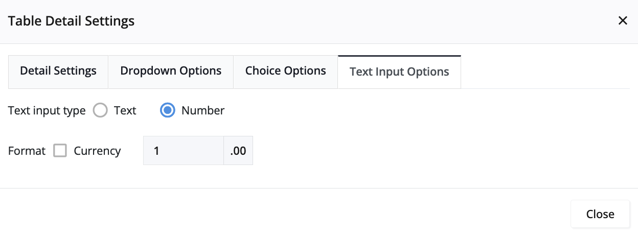
Table Calculations
For numeric data, you can enable automatic calculations that display formulas in dedicated calculation cells:
- Sum Column: Shows calculation formulas in the bottom row (e.g., “A1 + A2 + A3”).
- Sum Row: Shows calculation formulas in the rightmost column (e.g., “A1 + B1 + C1”).
- Sum Table: Shows a grand total calculation in the bottom-right corner.
- Calculate as: Choose between Number or Text format for calculation display.
To enable calculations:
-
Click on the Table field to select it and open the properties panel.
-
In the properties panel, click Table Settings.
-
Navigate to Detail Settings tab, and scroll down to locate the calculation options at the bottom.
-
Check the calculation types you want to enable:
- Sum Column: Adds calculation cells to the bottom row.
- Sum Row: Adds calculation cells to the rightmost column.
- Sum Table: Adds a grand total calculation cell.
-
Choose the calculation format:
- Number: Displays actual calculated values.
- Text: Displays calculation formulas (e.g., “A1 + B1 + C1”).
How calculations work:
- Each calculation cell shows the formula for adding the corresponding row or column values.
- Calculation cells are automatically generated and cannot be manually edited.
- The formulas reference cell positions (A1, B1, C1, etc.) for automatic calculation.
- When Calculate as Number is selected, the formulas evaluate to actual numeric results
- When Calculate as Text is selected, the formulas are displayed as text strings.
Calculation formulas reference cell positions and will automatically update when you add or remove rows and columns.
Best Practices
- Use selection features for scenarios where users need to make category-based choices.
- Combine selection types when you need both horizontal and vertical data grouping.
- Enable calculations for numeric data that requires automatic totaling.
- Group choice options appropriately to prevent conflicting selections.
- Set clear labels for column and row headers to guide user selections.
Test your table configuration with real users to ensure the selection behavior matches their expectations and workflow needs.