
Charts and analysis
On this page
Charts and analysis helps you choose how report data is displayed and determine which view is appropriate for the question you are investigating. You can compare answer counts, review numeric distributions, find recurring words in text responses, examine relationships between fields, and identify changes that may need further review.
Each chart card has a type switcher in its header. Click an icon to change how the field’s data is displayed.
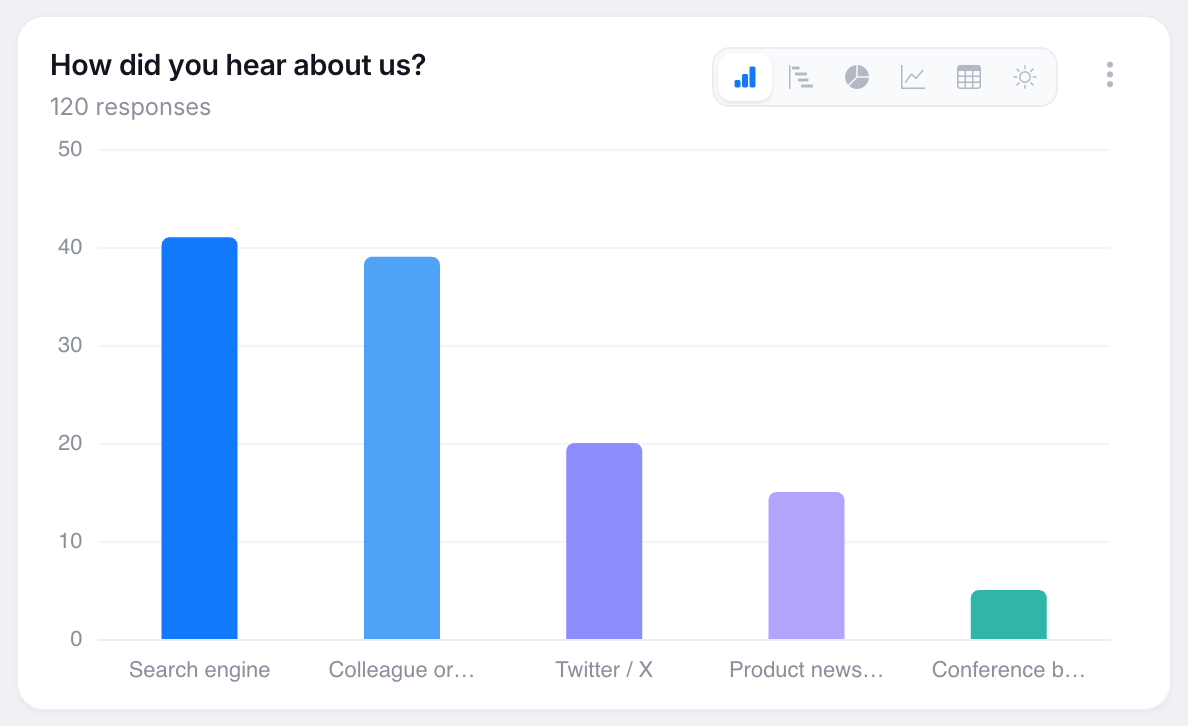
To add another chart, select Add ▾ → Chart, choose a form field, and configure how its data should be displayed.
Chart types
- Column and bar compare how often each answer was chosen. Use them to identify which options were selected most or least often. On charts with a Break down by field, they display groups side by side. A stacked column option is also available for viewing group composition.
- Pie and doughnut show each answer as a share of the whole. They are generally easier to read when the field has six options or fewer.
- Line and area show change over time.
- Table gives exact counts and percentages when precision matters more than shape.
- Treemap and funnel provide other ways to display the distribution of categories.
The following analysis views appear for fields that support them.
Statistics (numeric fields)
Rating, slider, and number fields can be displayed as a statistics card. The card shows the median as its primary value, a Mean pill, the standard deviation with a plain-language spread label, a p25 / p75 / minimum / maximum grid, and a distribution strip.
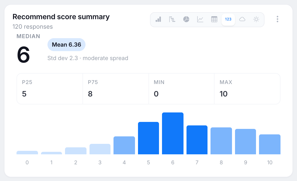
The median is the middle answer: half of the answers are higher and half are lower. Unlike the mean, it is less affected by a small number of extreme answers. A Low spread label indicates that answers are relatively close together and people broadly agree. A Wide label indicates that answers are more dispersed and opinions are split, so the mean alone may not represent the range of responses.
Word cloud (text fields)
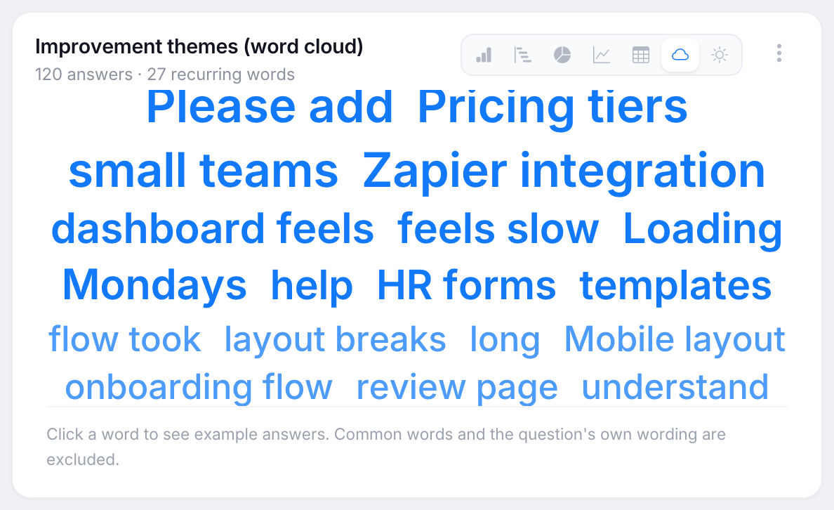
A word cloud shows words that recur across text answers. Word size is based on how many answers mention the word. Common words and wording from the question are excluded, recurring two-word phrases remain together, and a word must appear in at least two answers to be included. Click a word to view example answers that contain it.
Cross-tab matrix (breakdown charts)
A chart with a Break down by field can be displayed as a matrix. Rows represent one question and columns represent the other. Use the Row % / Counts toggle to switch between percentages and answer counts. Cells are shaded relative to the maximum value in their own row, so the darkest cell shows where that row’s responses are concentrated. Use this view to examine whether the answers to two questions may be related.
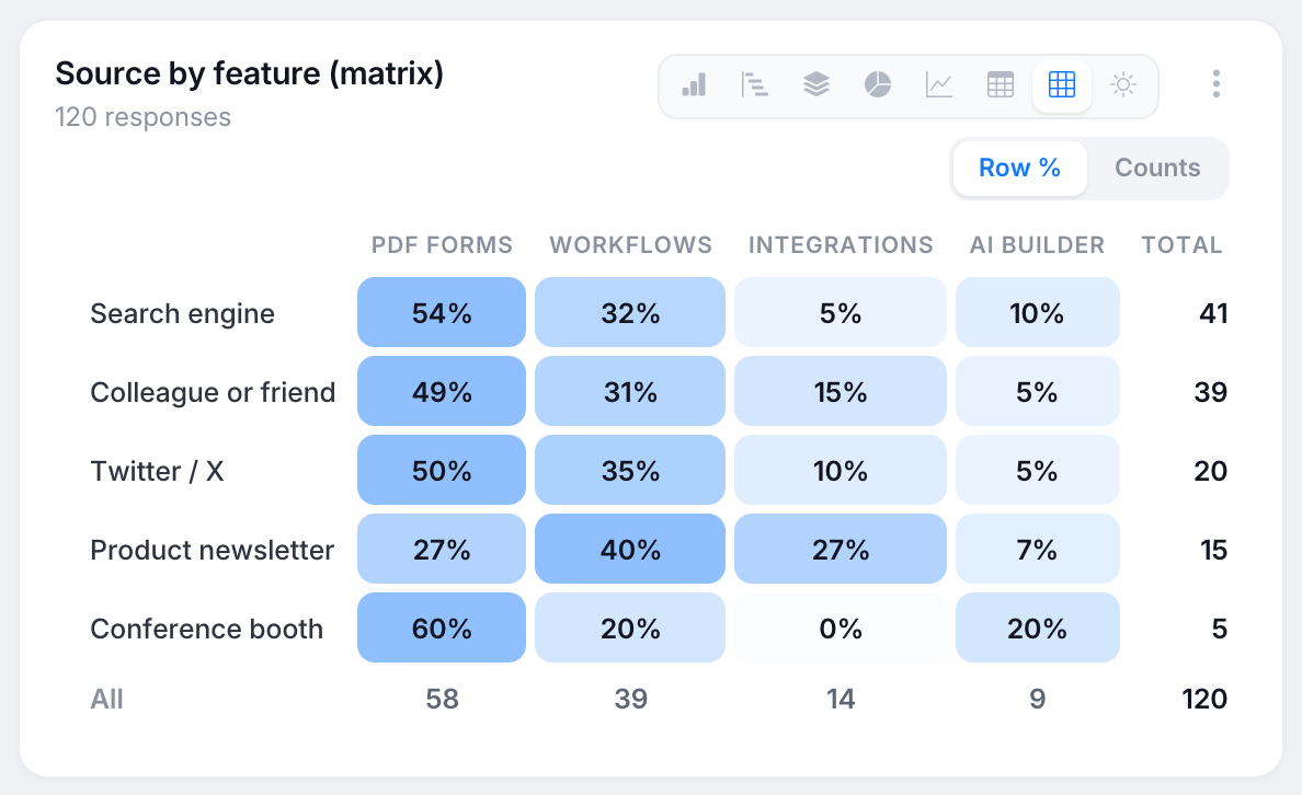
Chart annotations
-
Significance chip: breakdown charts can show a blue Meaningful difference or gray No clear difference chip based on a standard chi-square test. Hover over the chip to view the numbers. No clear difference is a calculated result. If no chip appears, there is not enough data to calculate either result. Differences between small groups can occur by chance, so review this chip before drawing a conclusion from a visible difference.
-
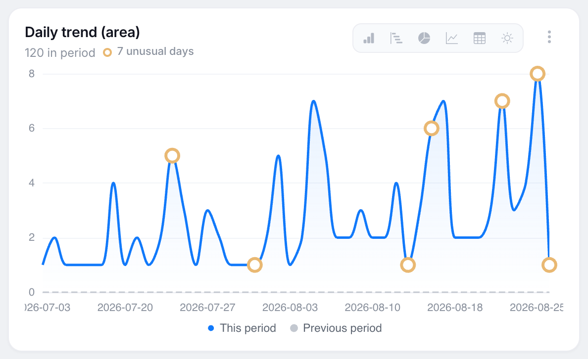
Unusual days: daily time charts mark days whose value is at least twice that weekday’s average over the previous four weeks. A marked increase may correspond to campaign activity. A marked decrease may indicate a problem with a form link or embed. These are possible explanations rather than diagnoses. The thresholds are fixed, so the same data produces the same markers.
-
Insight pills: when Compare to previous period is enabled, a pill appears next to the chart subtitle if the total changed meaningfully or the top answer changed. These pills are calculated from the report data and do not use AI.
Use the chart menu
Click the ⋮ button in the top-right corner of a chart card to open its menu. The menu contains:
- Edit — change the title, field, colors, metric, sort order, top-N with an Other category, breakdown field, or filters.
- Chart width.
- Clean up categories.
- AI options described in AI in Insights.
- Move up or Move down.
- Delete.
Select Add ▾ → Text block to insert a titled note card between charts. You can use text blocks to add explanations or context to a shared report.